

Panalpina, was a Swiss company listed on the SIX Swiss Exchange, and one of the world's leading freight forwarders. Combining air freight, ocean freight, and logistics, Panalpina delivered end-to-end supply chain solutions, to large, medium, and small enterprises from various industries. It operated a network of 500 offices in more than 80 countries and employed 14,500 people worldwide. It was subsumed into DSV in August 2019.
As a large company with a rich heritage, Panalpina had many legacy IT solutions built with no particular focus on user-centricity and design consistency at the time. An ongoing digital transformation was the perfect timing for a complete redesign. In this context, I was asked to define and deliver consistent, engaging and intuitive user experiences, across all their digital products, with the main objectives to increase end-users' satisfaction and operational efficiency.
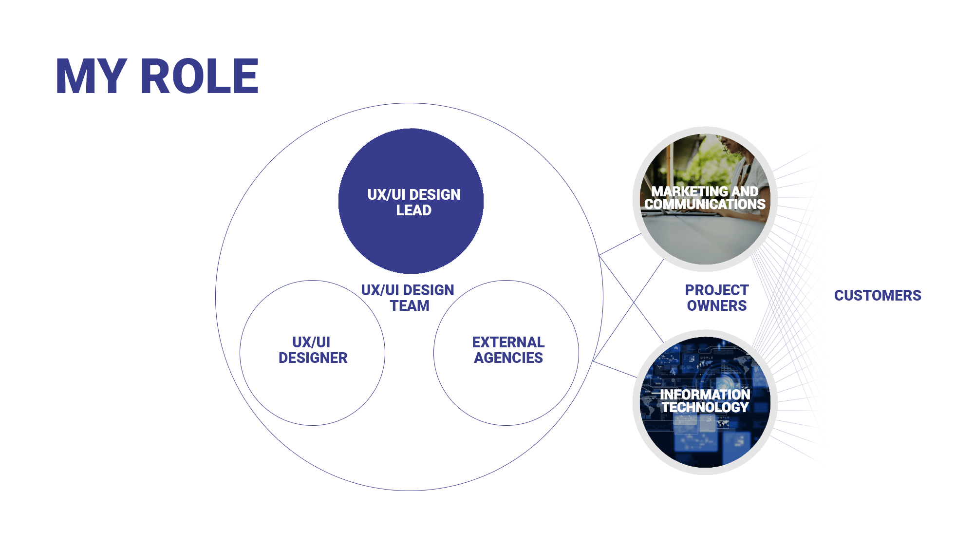
As Corporate UX/UI Design Lead, I had a team of two as well as the support from external agencies. I led the design of customer-facing and forwarding digital products, owned either by IT or by the Marketing and Communications department.
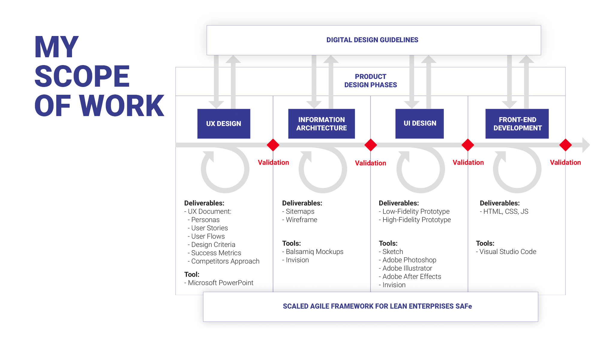
My scope of work encompassed all design phases of a digital product, from user research to usability testing, through user interface design and front-end development.
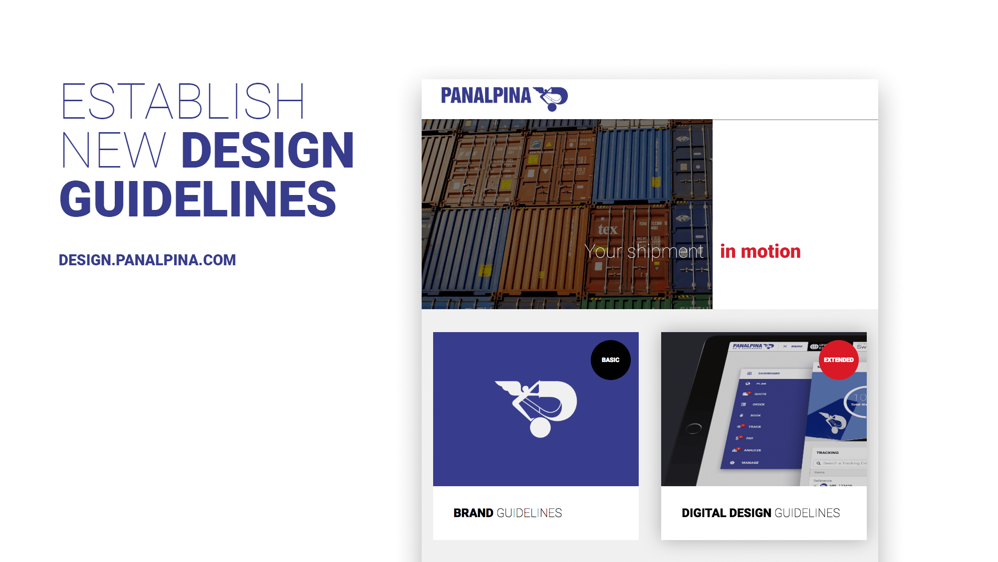
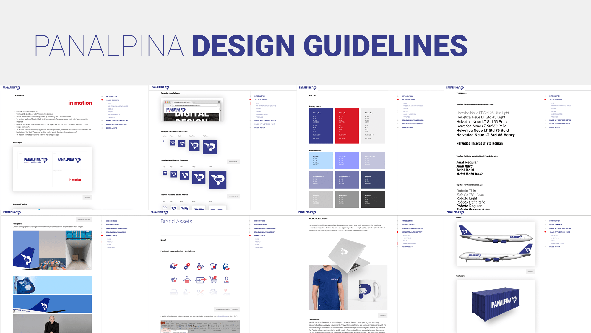
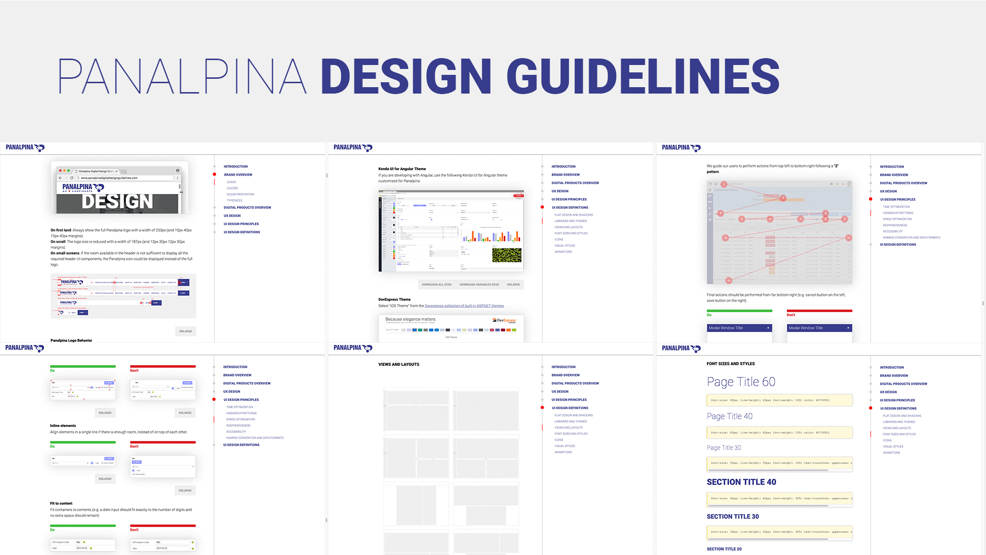
My very first task was to create the Panalpina digital design guidelines in order to guarantee design consistency across all existing and future digital products. I was then asked to do a soft rebranding, with the introduction of a new tagline, and to implement a digital brand center with revised guidelines.
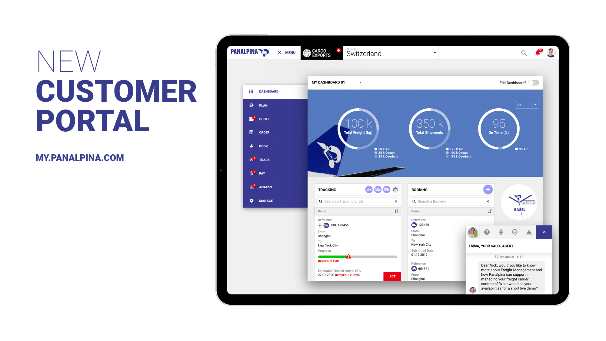
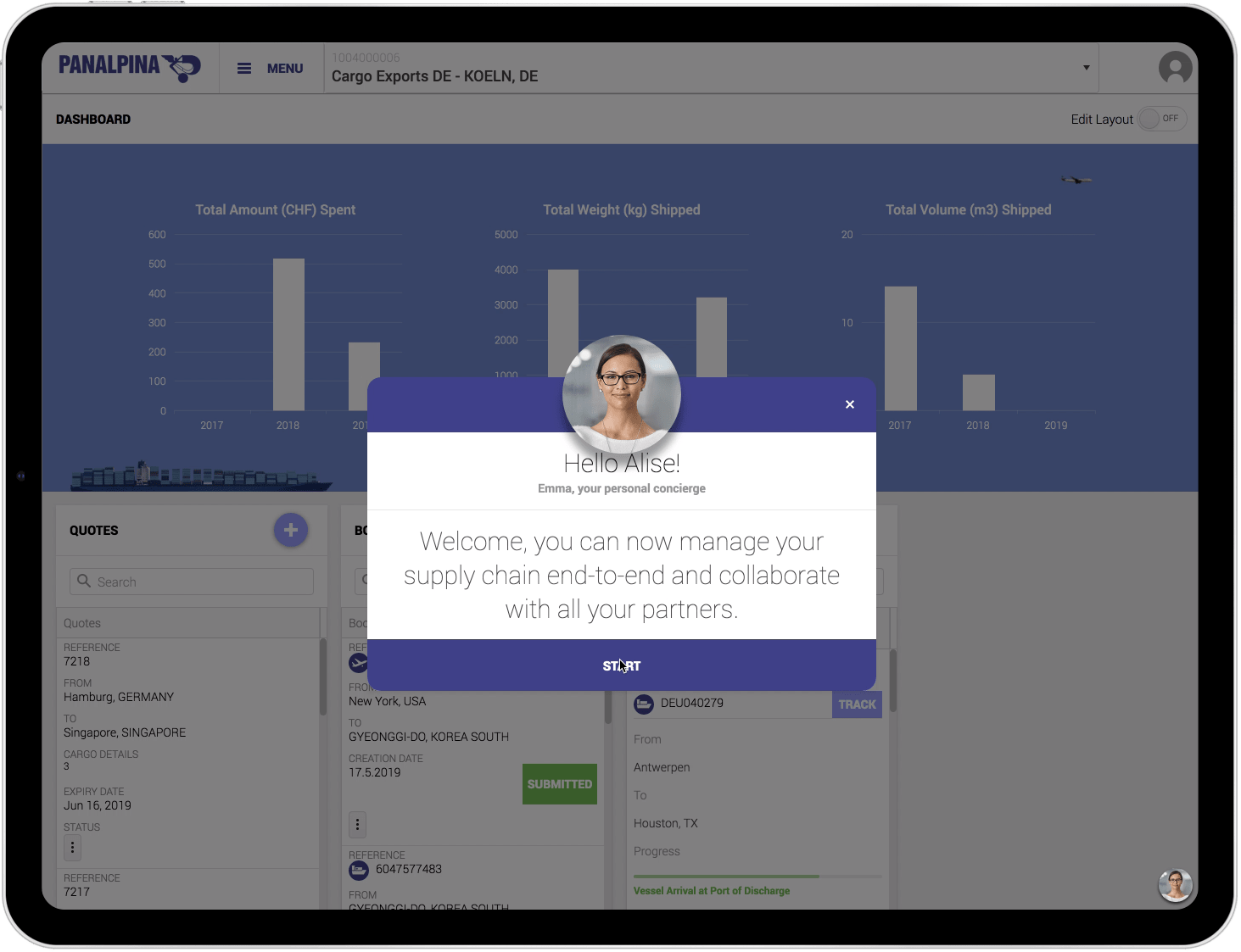
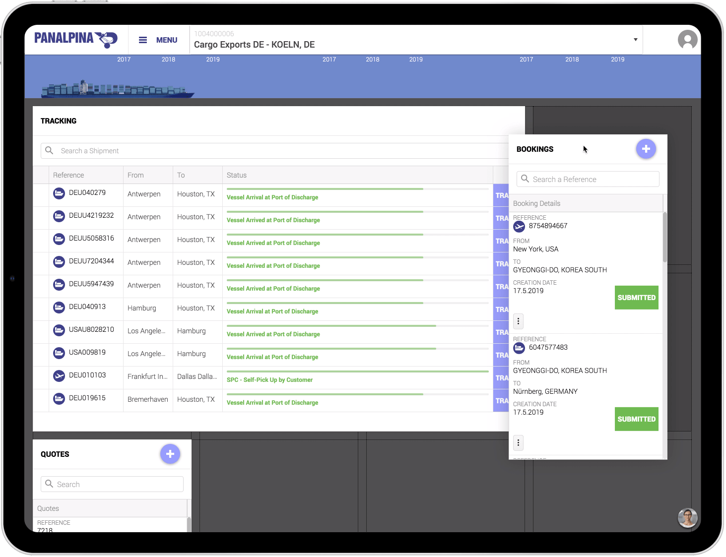
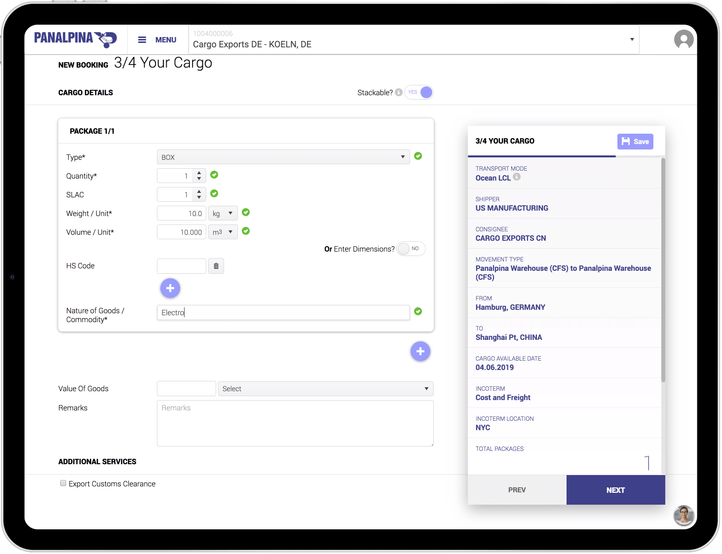
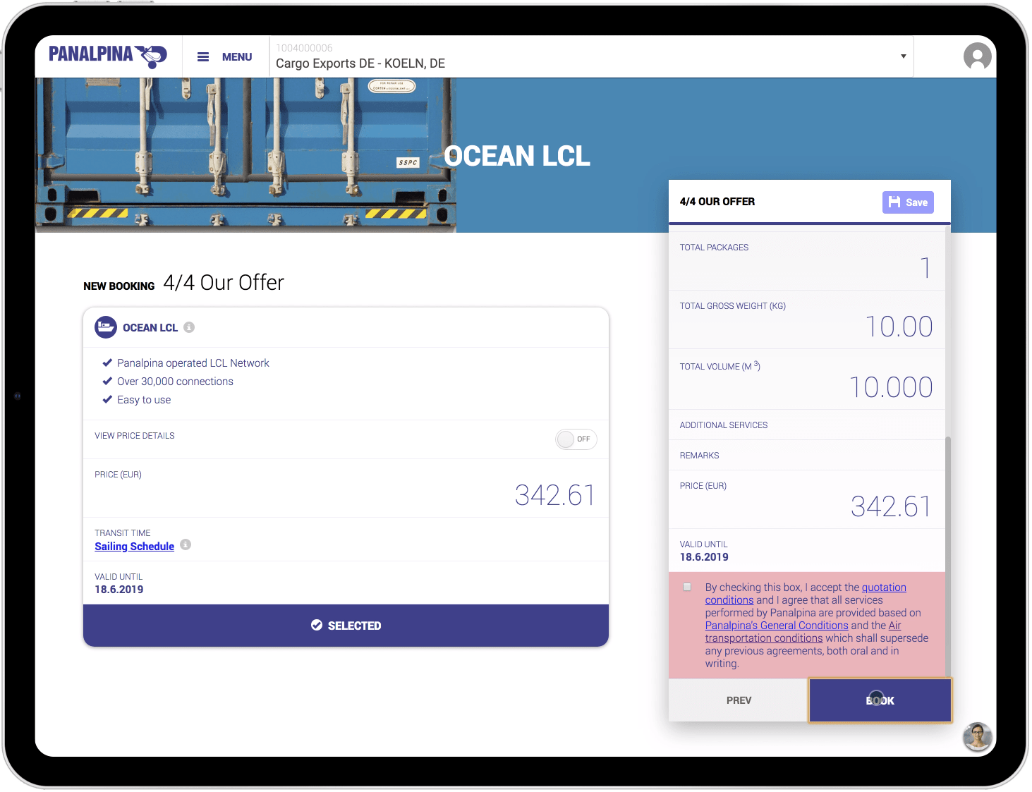
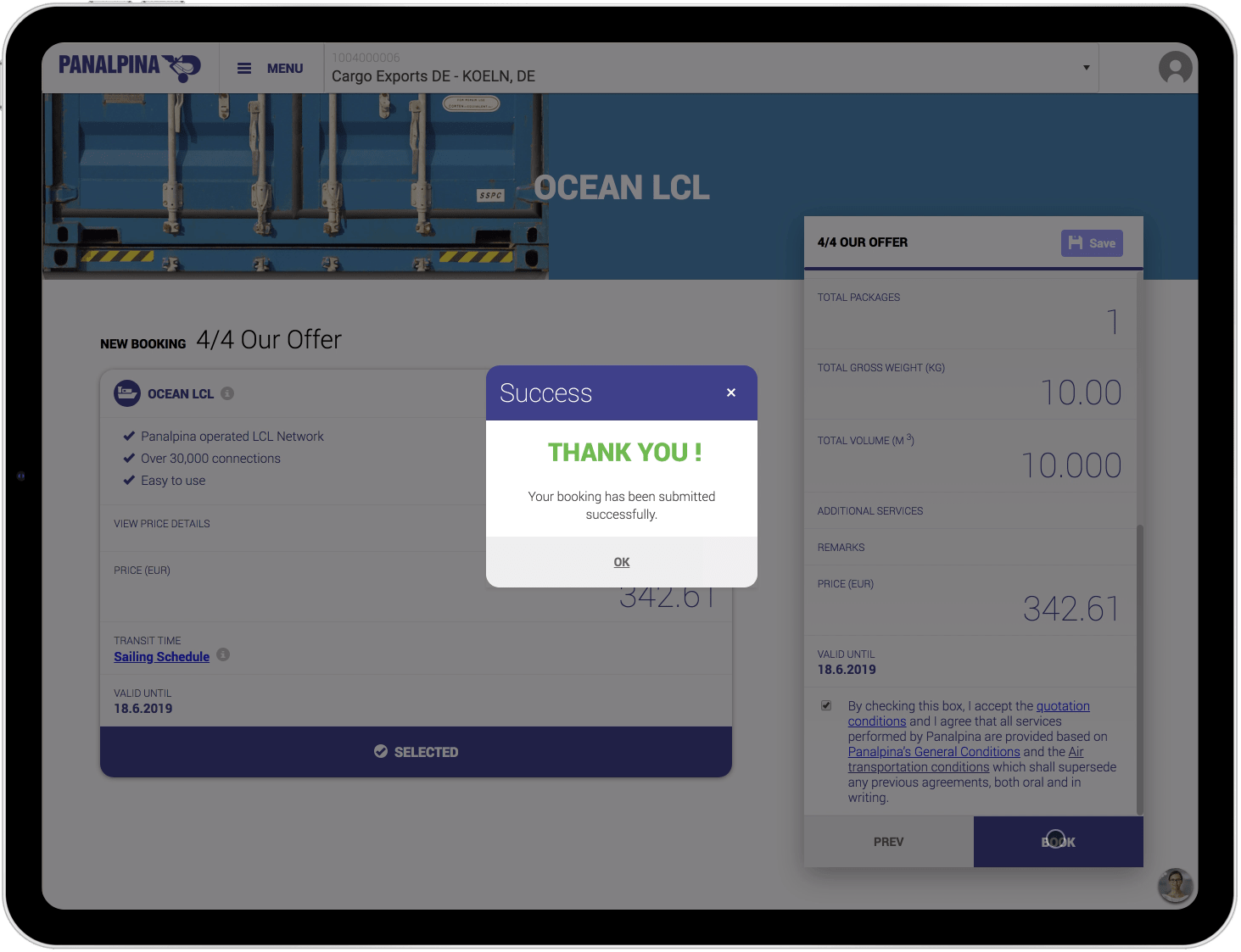
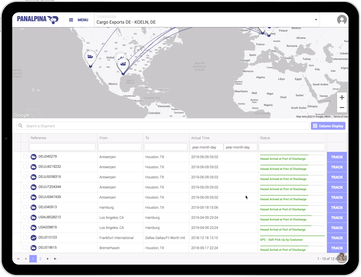
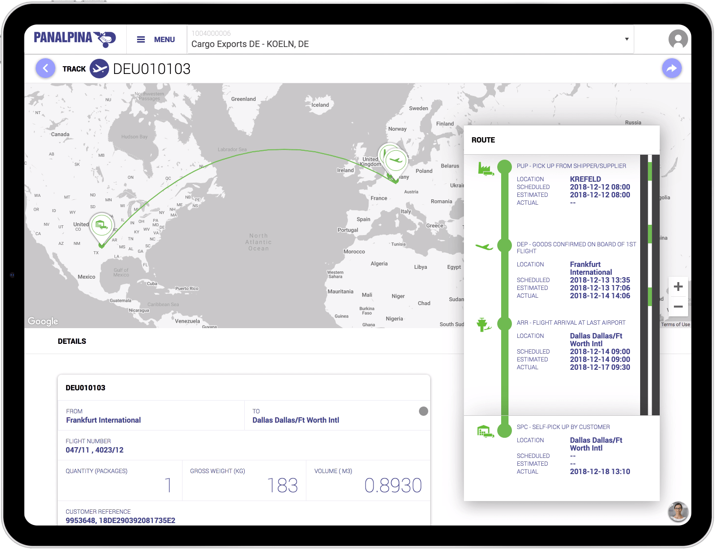
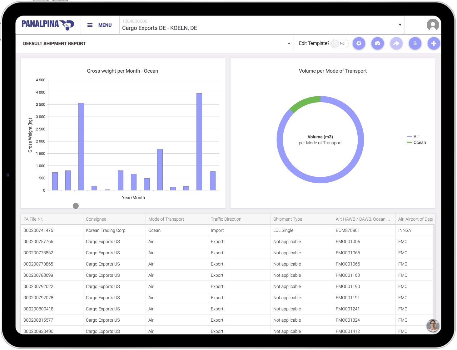
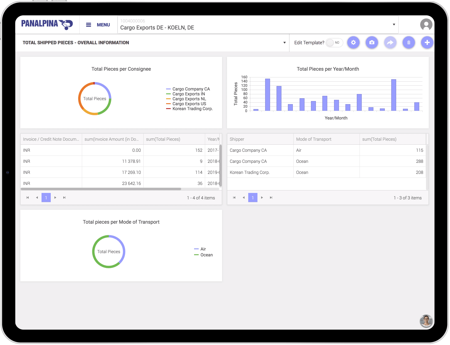
The customer portal is the single digital platform for Panalpina's customers to manage their entire supply chain end-to-end with all their teams and partners. Users can get instant quotes in order to book and track their shipments, and use their data to create reports.
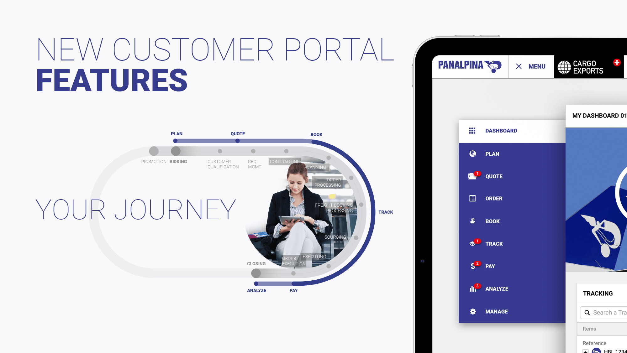
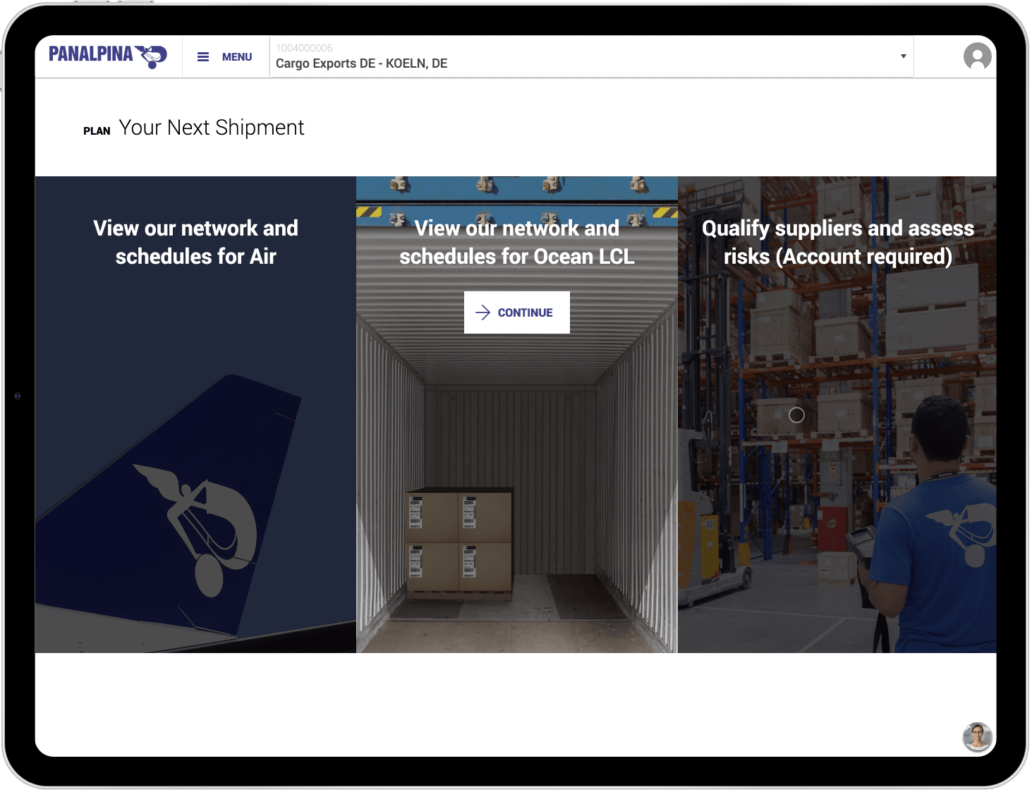
Each feature of the portal follows a step of the shipment's journey: Plan, quote, order, book, track, pay, analyze, and manage.
Once the project was approved and kicked-off, I have led a one-week Design Thinking workshop with various stakeholders from across the company for each feature.
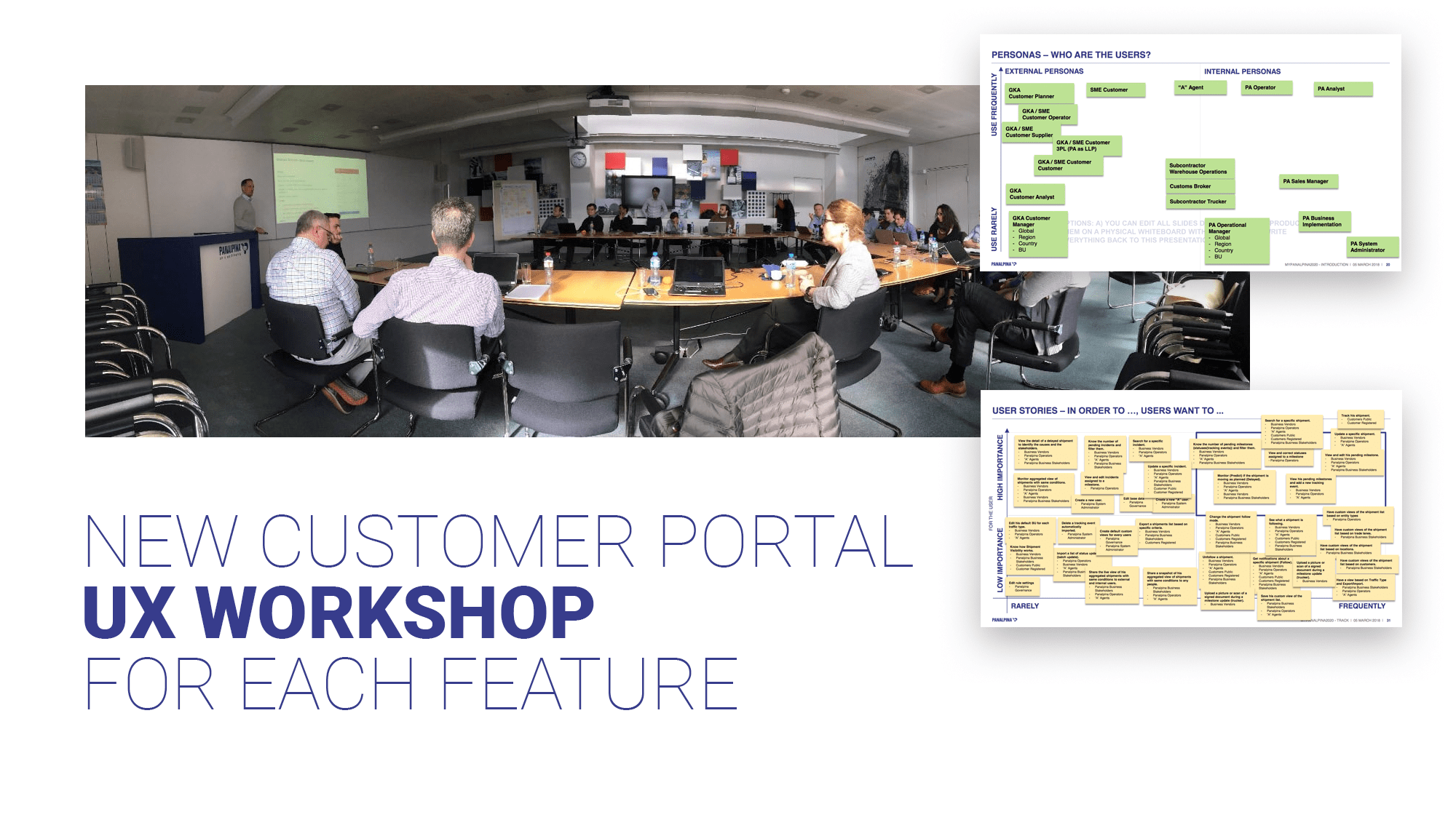
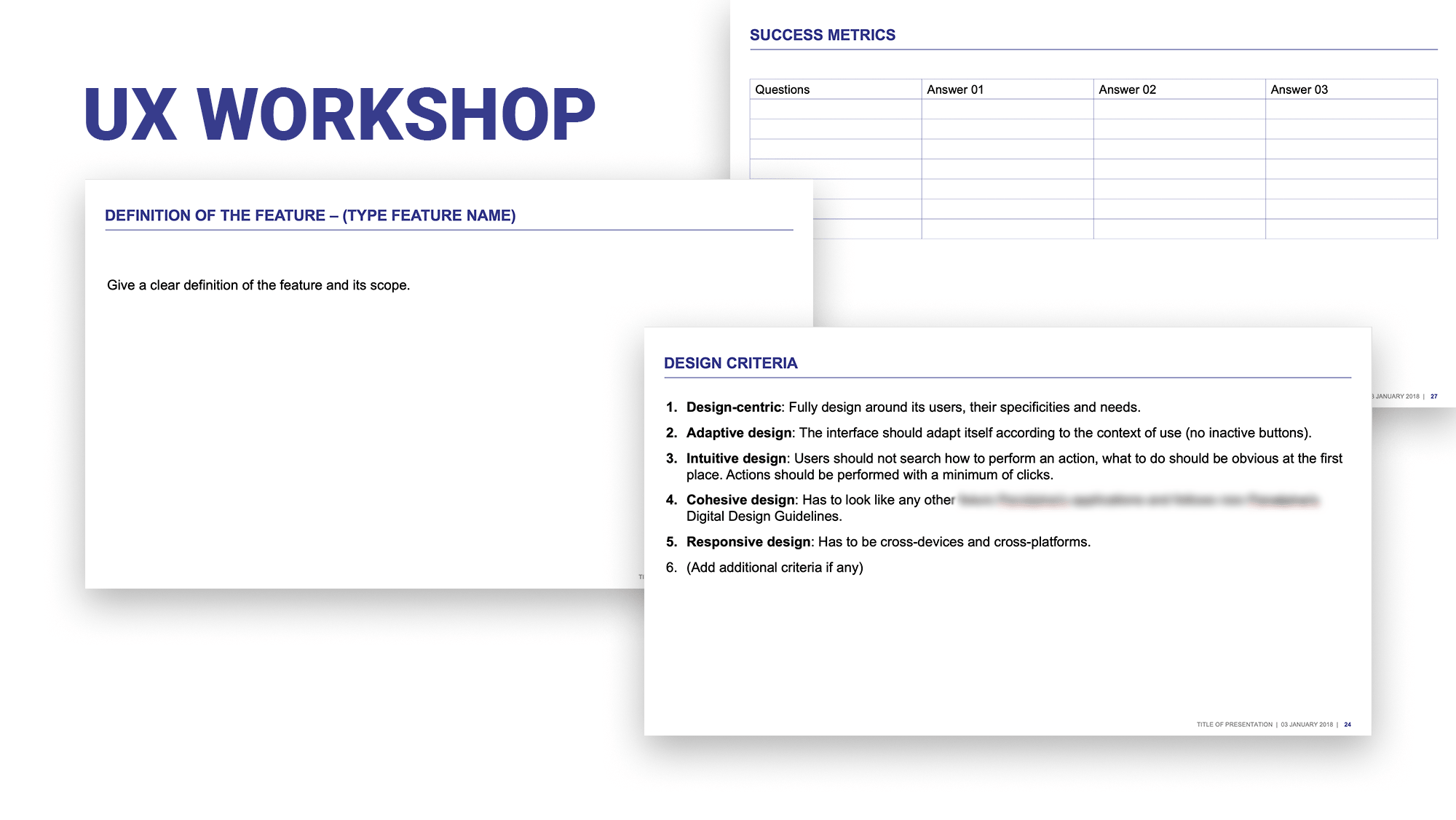
The participants were asked to define the feature's scope, success metrics, and design criteria...
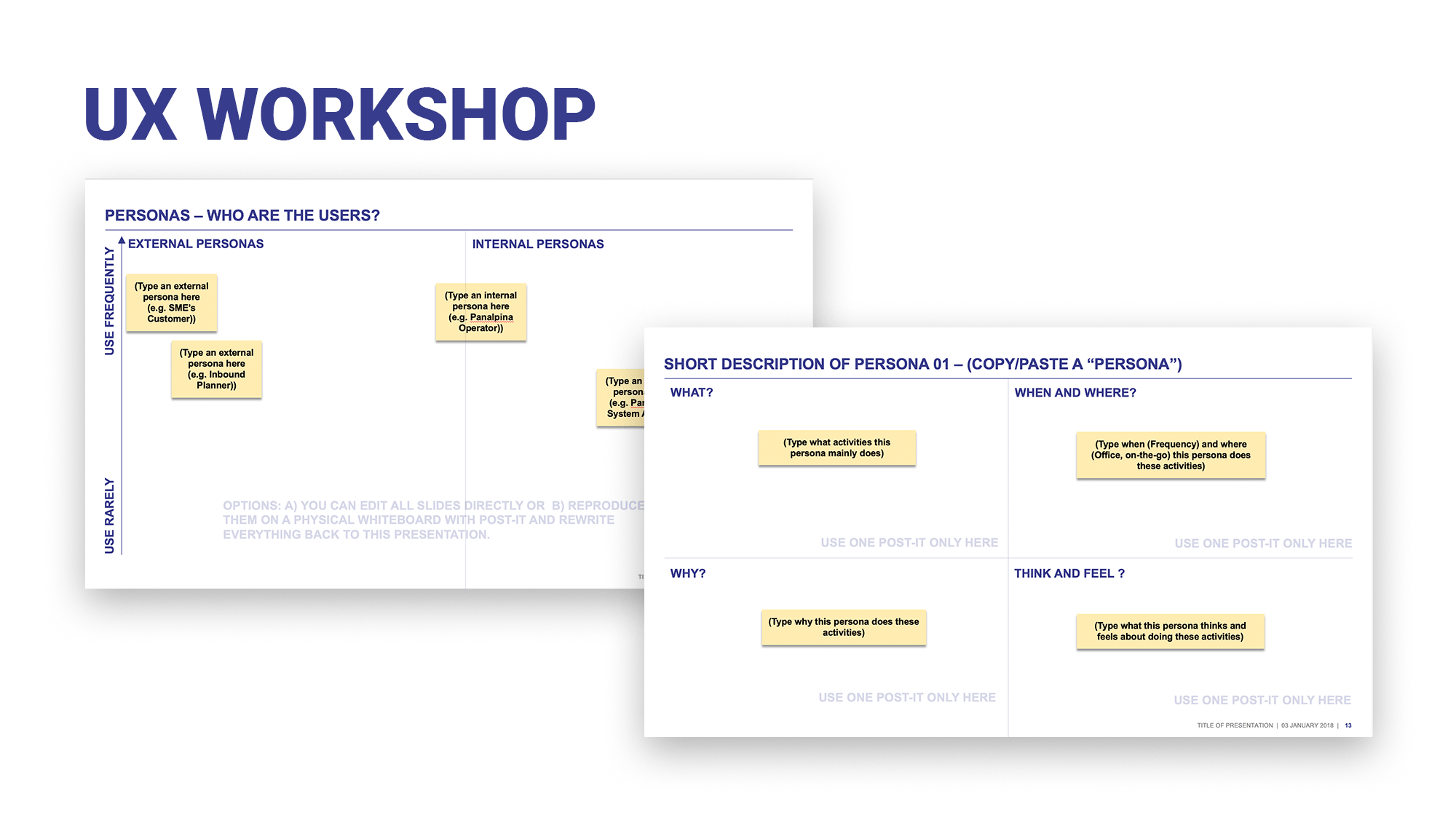
...As well as the personas: Are they external or internal users? How often do they use the product? And a short description of each persona: What do they do with the product? When and where do they use it? Why is the product important to them? And what do they think and feel about the current solution?
Every possible action within the feature's scope was listed down and categorized by frequency and importance for the user. All the steps to complete each action end-to-end were defined and participants were asked to flag possible issues and ideas for improvements during this exercise.
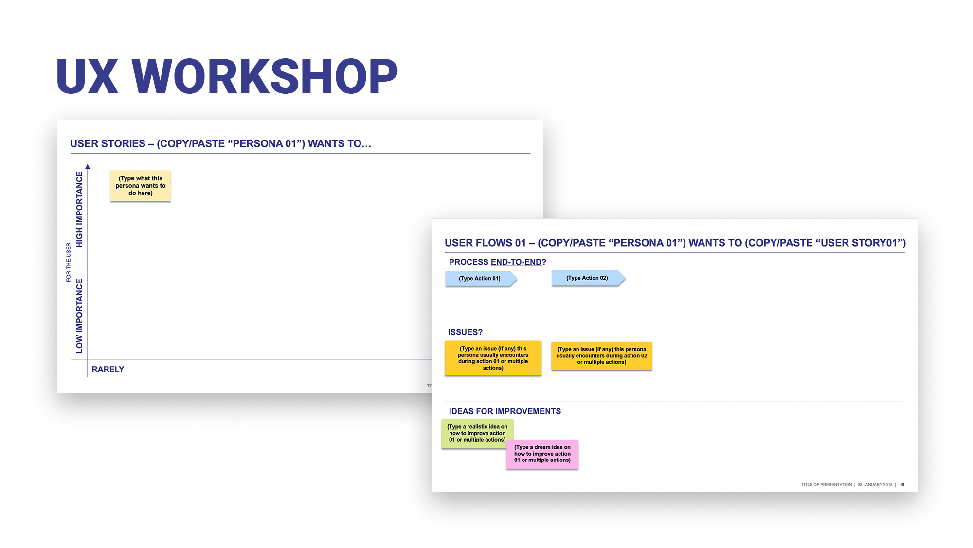
All the ideas for improvements were then categorized by the level of feasibility and importance for the user. Another exercise well appreciated by the participants was to look at the competition for similar products and to point out the pros and cons of their approaches.
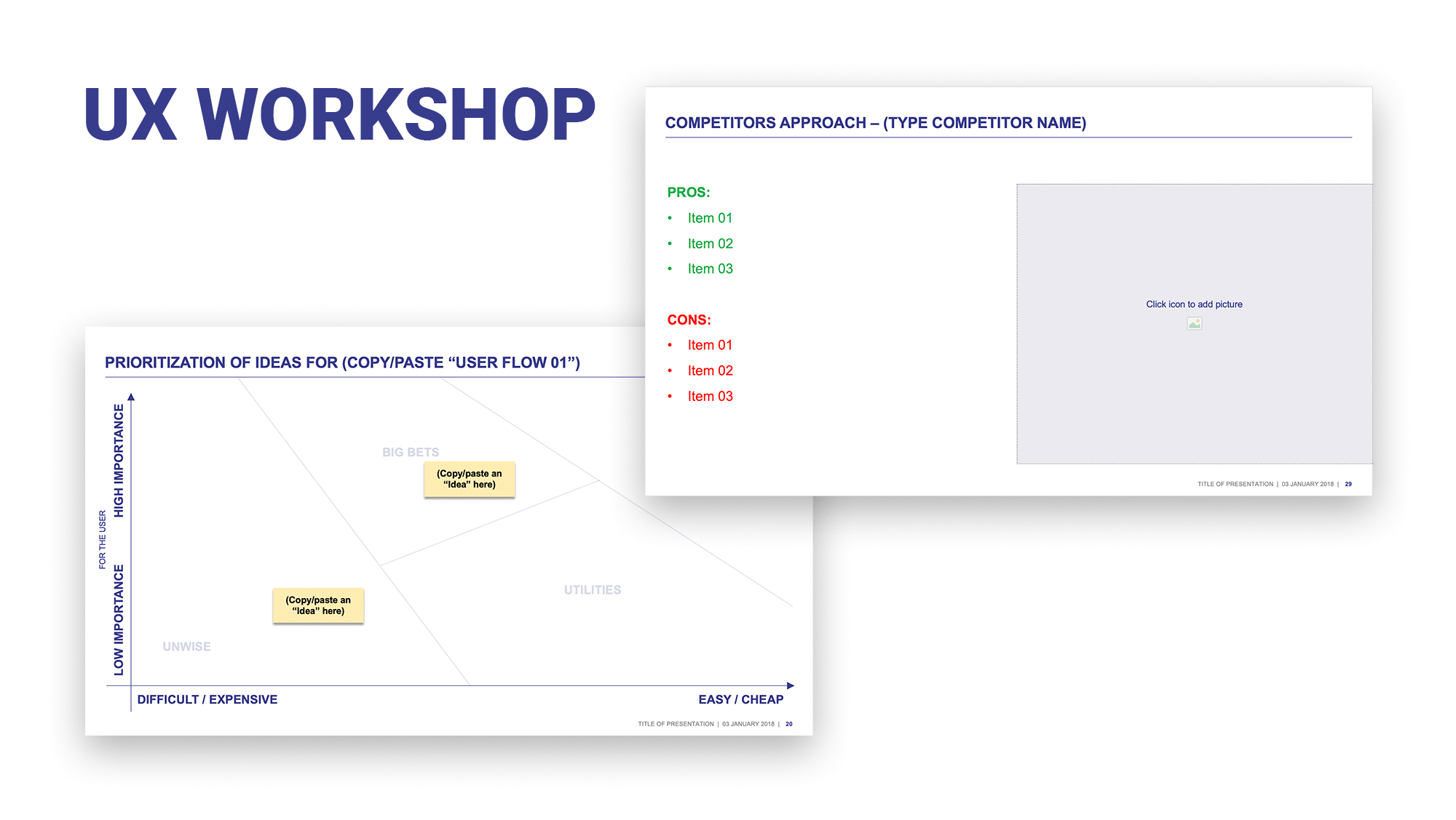
All these valuable inputs allowed me to design the information architecture and more than a hundred low fidelity screens, all compiled in an Invision click-through prototype, shared to the Design Thinking participants for their reviews and approvals.
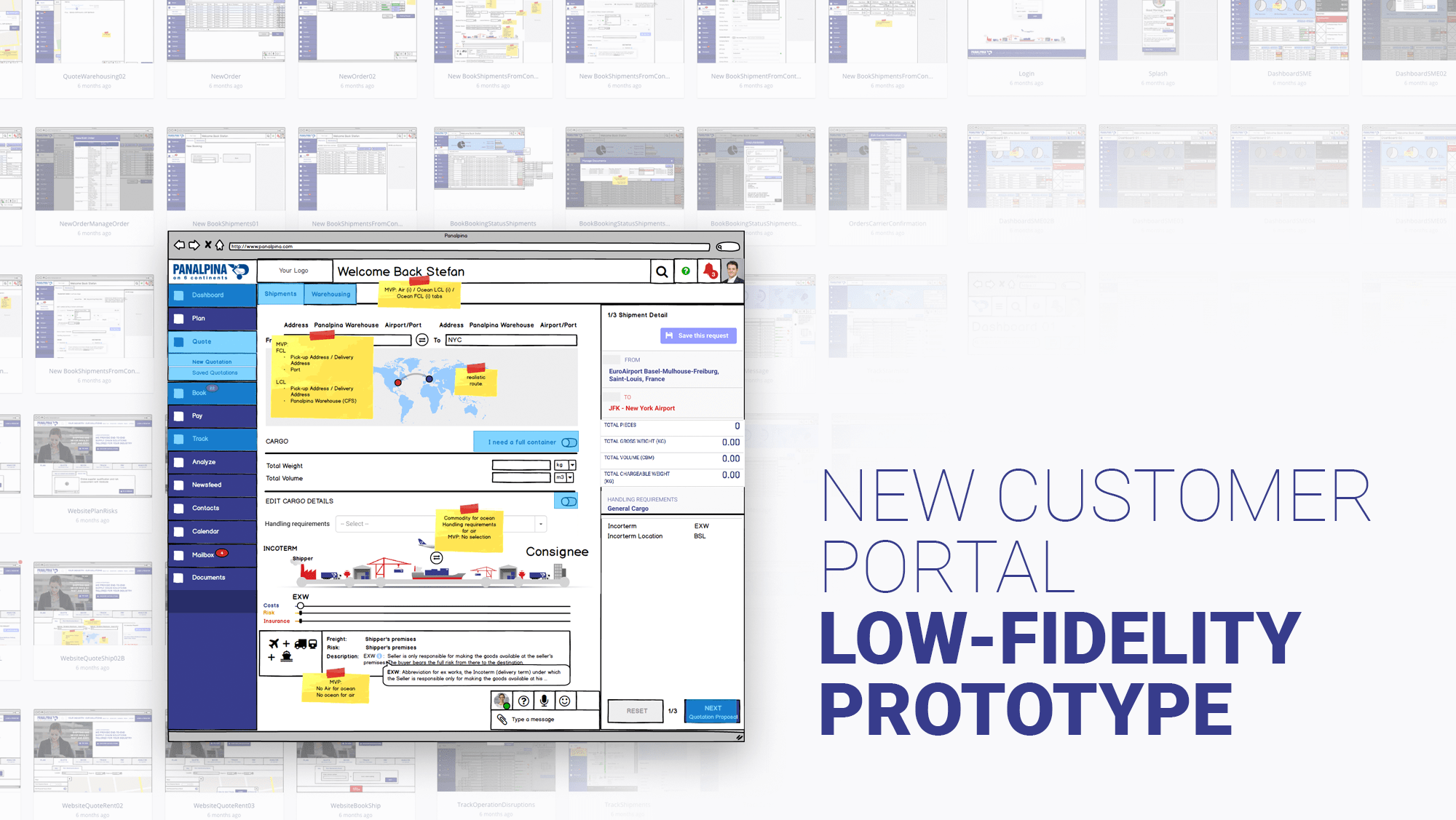
The comments left by the participants in InVision helped me to refine the user experience and the design of interfaces, until a comprehensive and realistic click-through prototype was complete, which became the base for any further discussions.
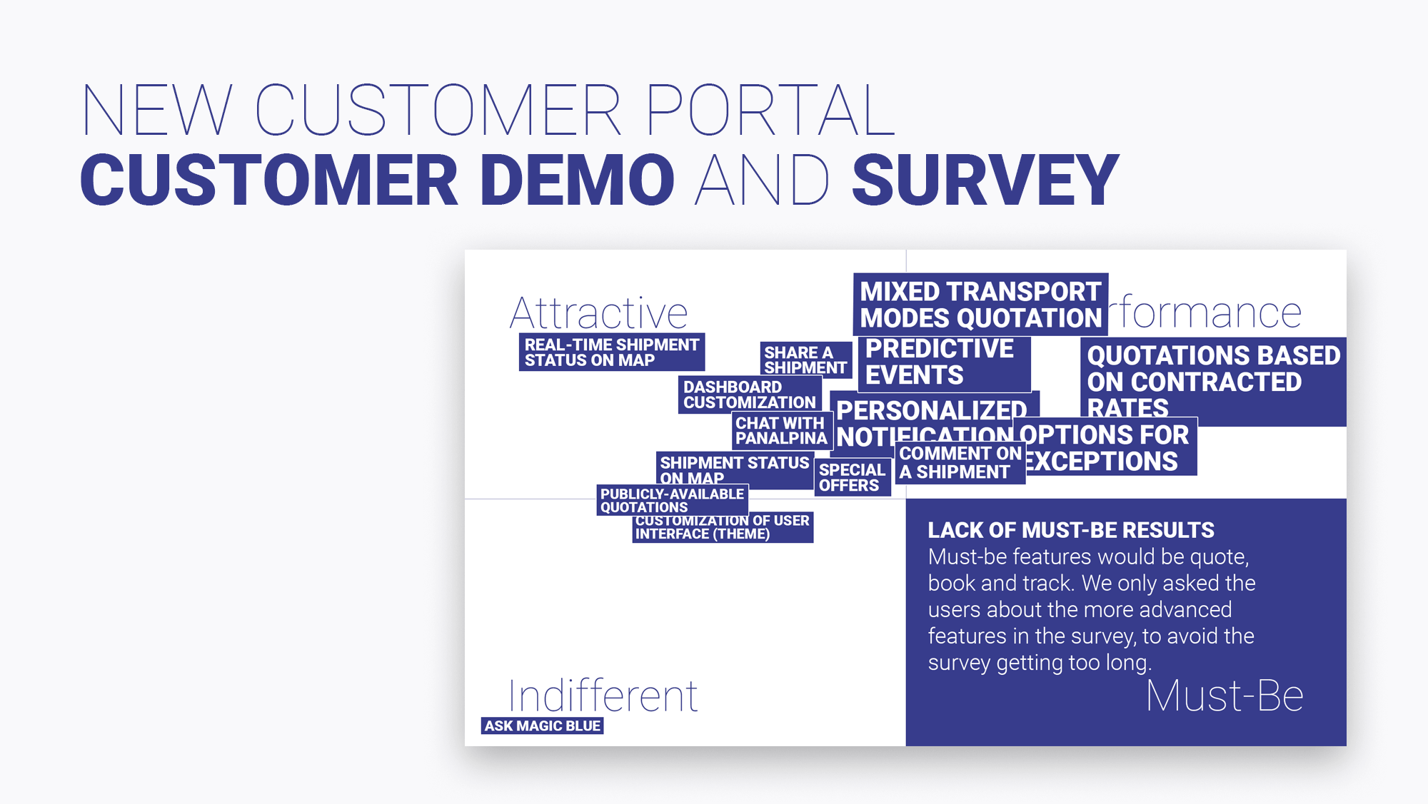
The same prototype was used during several customer demos followed by a survey in order to rate a list of core functionalities, from a must-be functionality to an indifferent one. By applying the Kano model to the results, the business was able to give priorities during the product development.
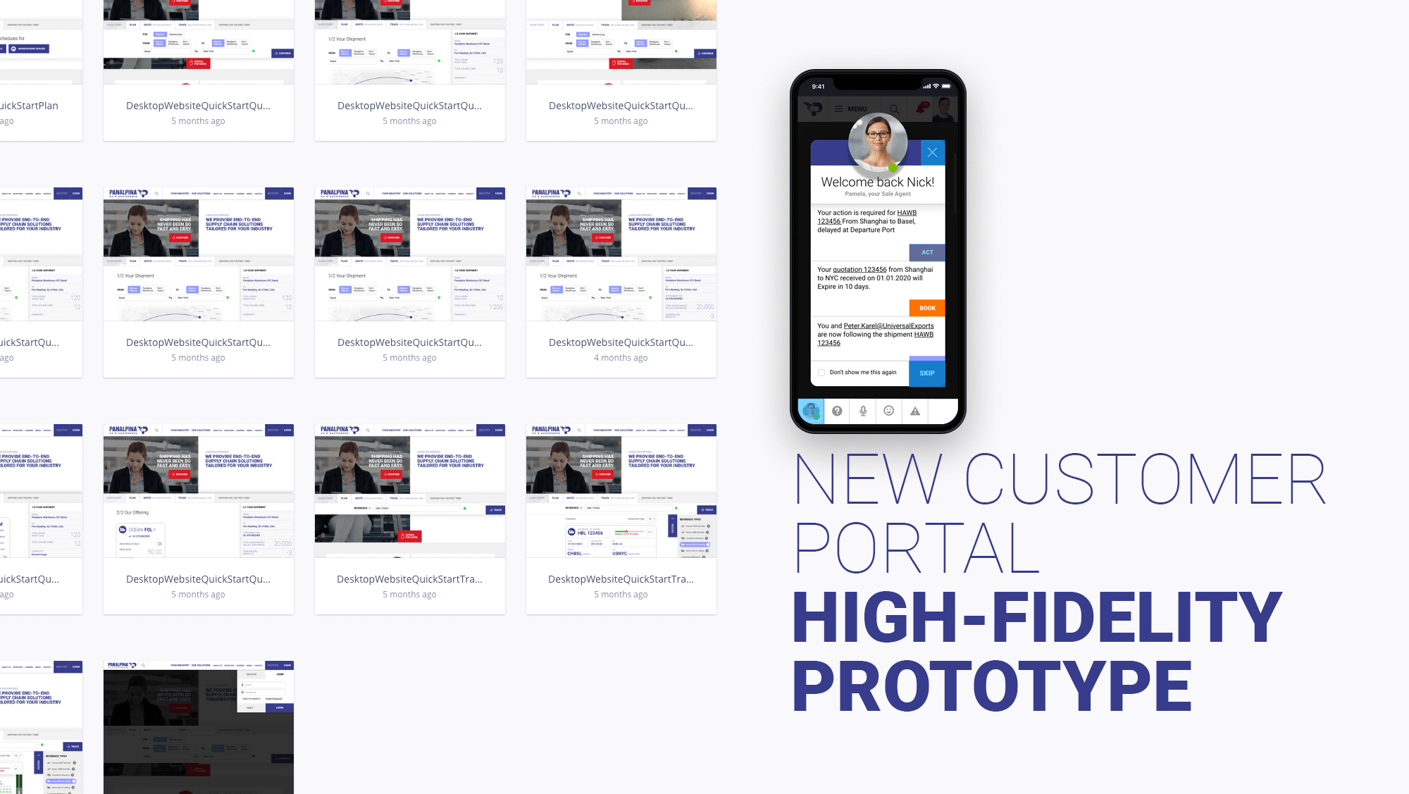
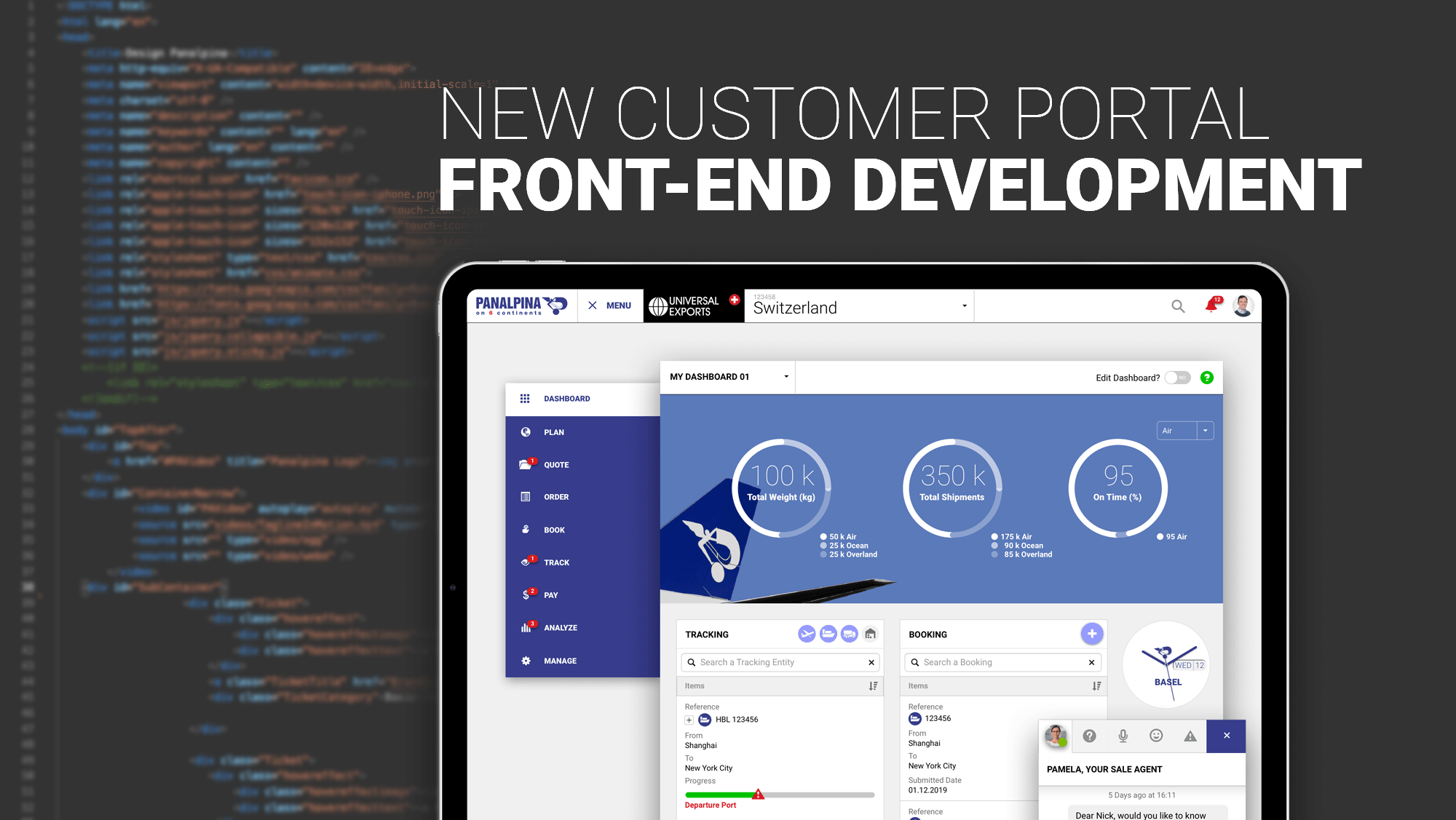
I was highly active in the front-end development part, writing the main CSS stylesheet as well as all the layout templates in HTML. I also chose and customized the look and feel of the UI components library from Kendo UI for Angular.
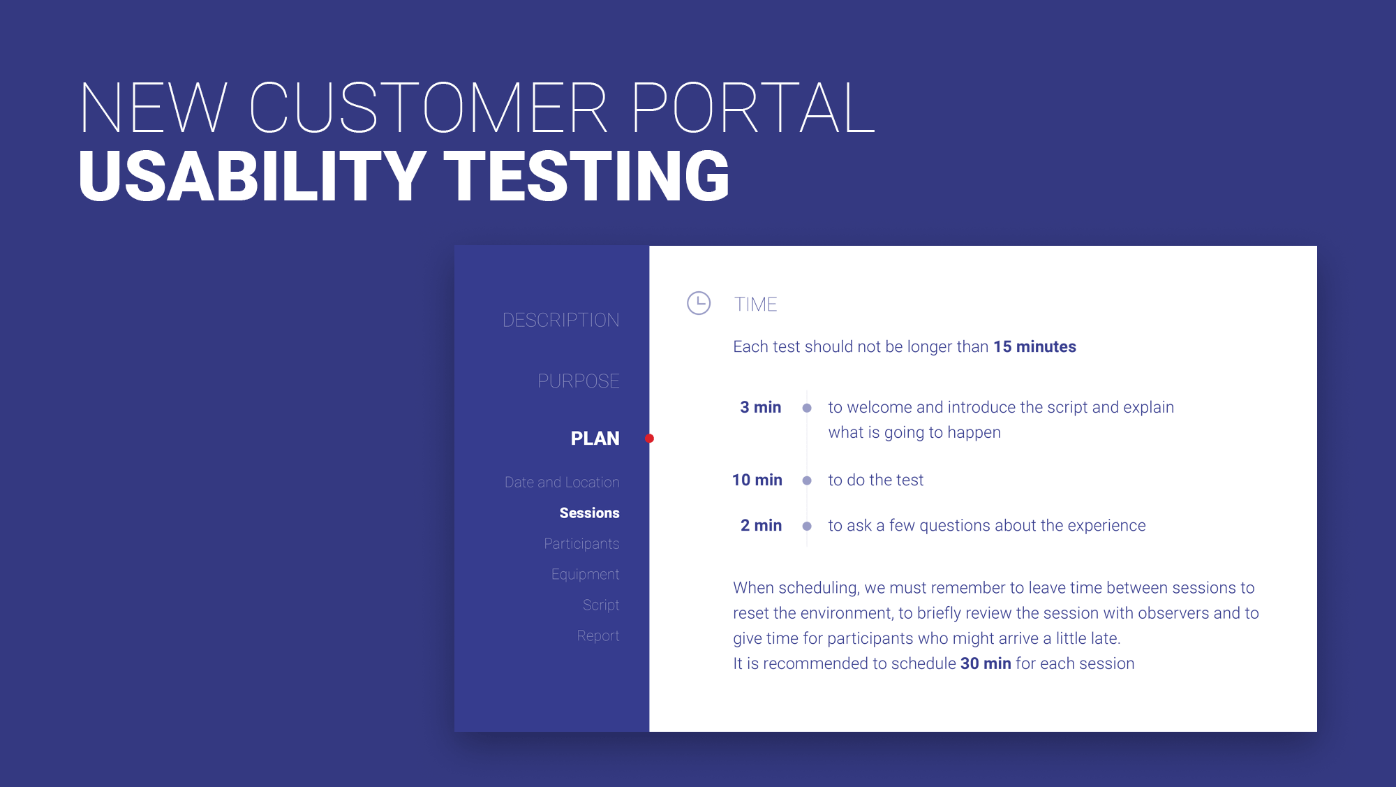
Right after the first release on the Quality Assurance environment, usability testing was conducted. A group of end-users was asked to perform several actions following a script while being observed (live or remotely) and recorded, to rate their experiences.
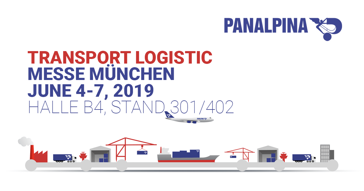
In June 2019, we introduced the portal to our customers and the industry at Transport Logistic in Munich, the world's leading trade fair for logistics, transport, and supply chain management.
I had the exciting opportunity to take over the art direction of Panalpina's presence at the show, including the design of the marketing campaign, various collaterals, and the booth.
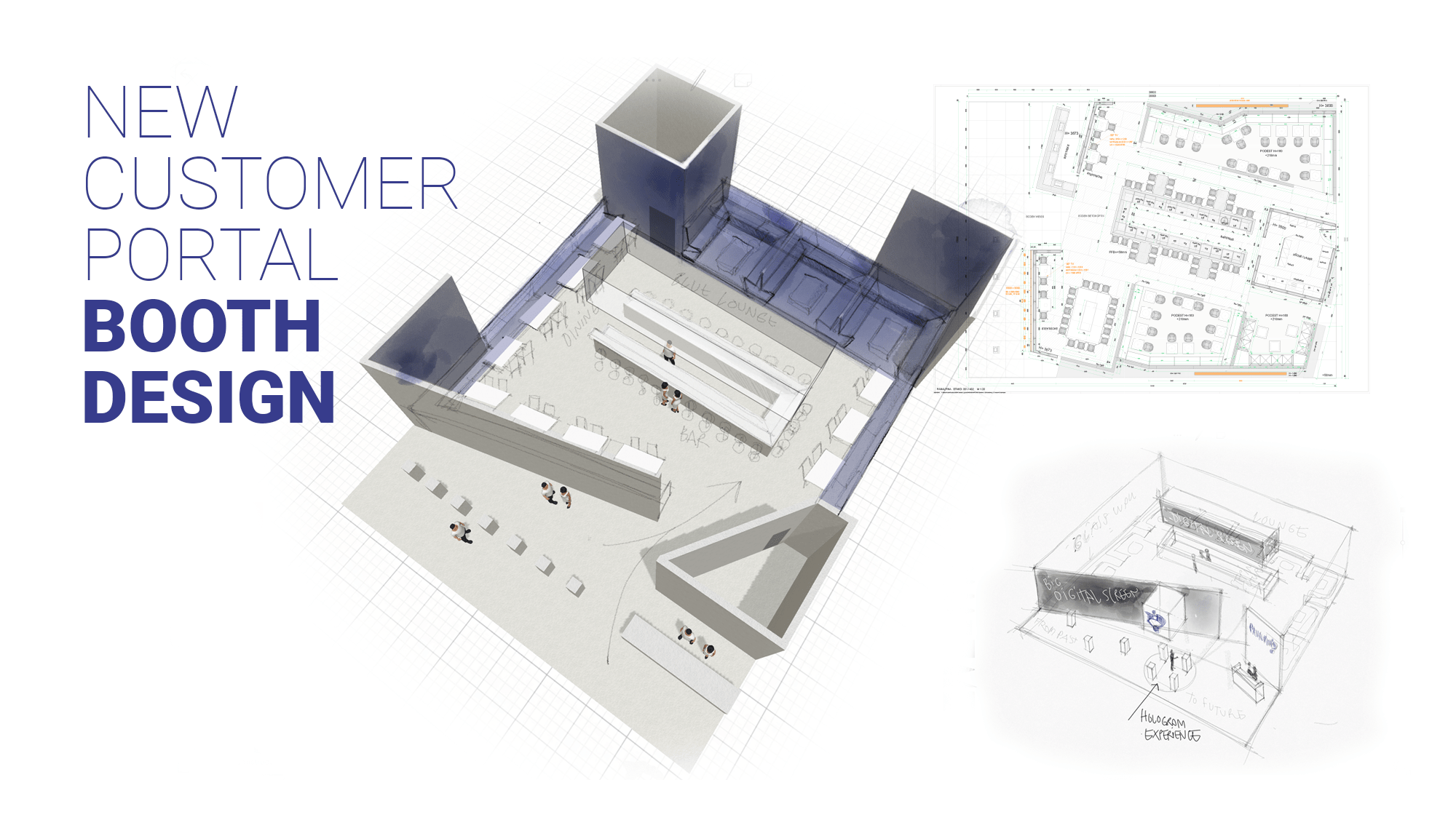
In addition to security regulations and cost constraints (e.g. reuse of elements from the previous fairs), the challenge was to keep a maximum number of seats for customer's meetings, usually around a meal or a drink, as well as making enough room to showcase the brand new customer portal.
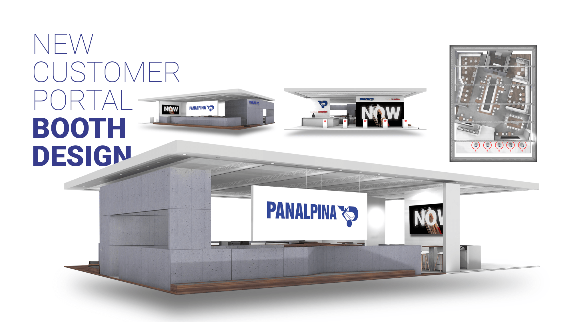
The chosen option was to use the busiest side of the booth to let visitors try the customer portal on four iPad stands, facing a big, eye-catching screen, raised next to the main entrance and the reception desk.
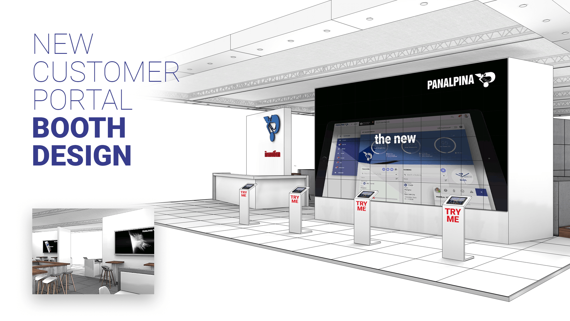
While the cozy interior of the booth is more appropriate for business talks, the minimalist and high tech exterior reflects the digital-first strategy of Panalpina and echoed the company's promise: Bringing the future of digital supply chain management.
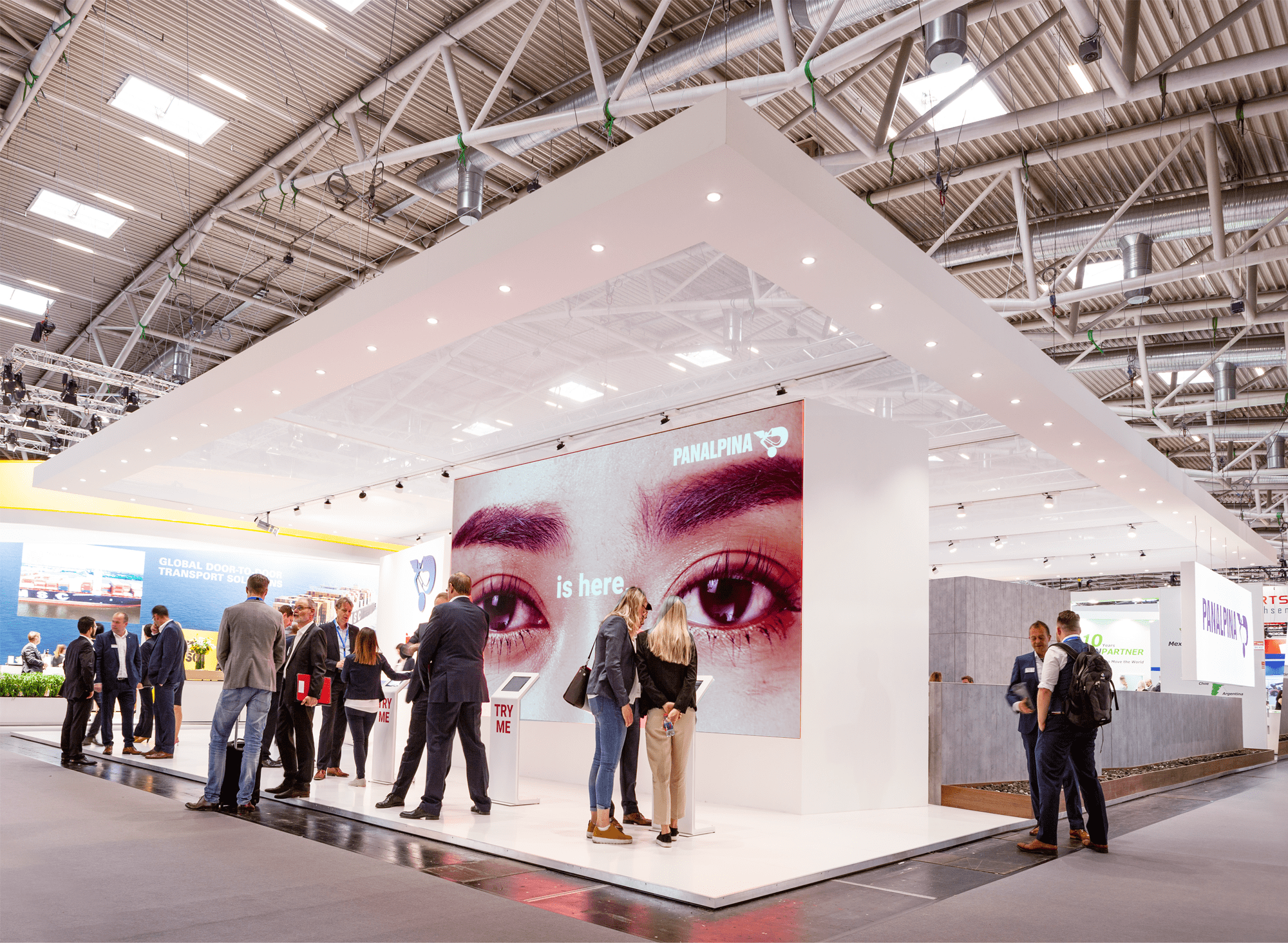
These 5 intensive days were a unique opportunity to get as many instant feedback from visitors as possible.
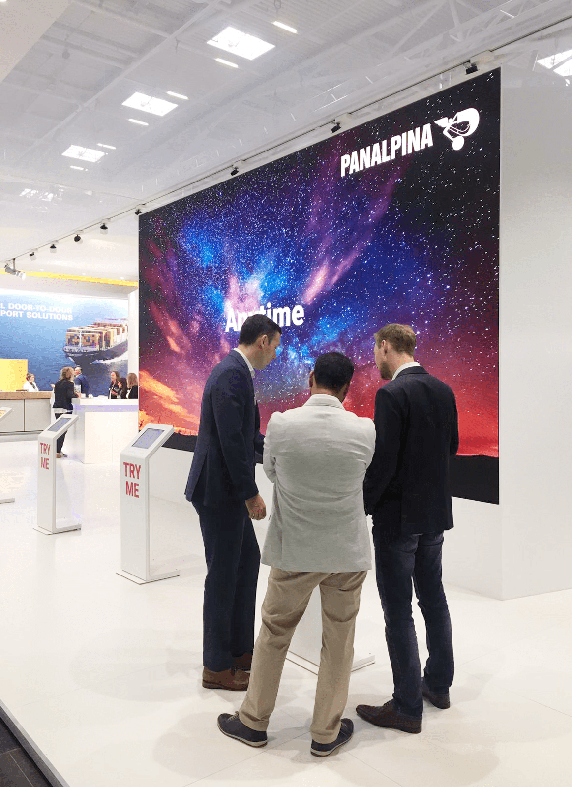
I also directed the making of the customer portal promotional video displayed on the big screen...
... and on social media channels.
As the designer of the booth, and the product being launched, being part of the booth team was a memorable and rewarding experience!
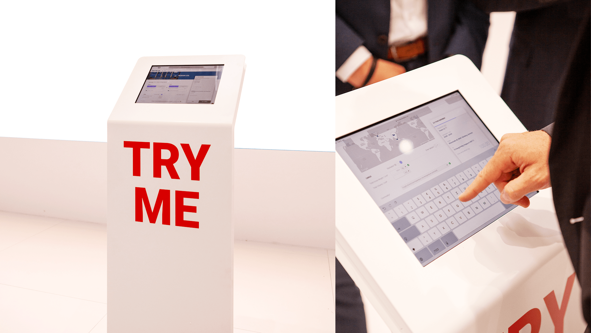
Visitors trying the customer portal in a sand-box environment on iPads.
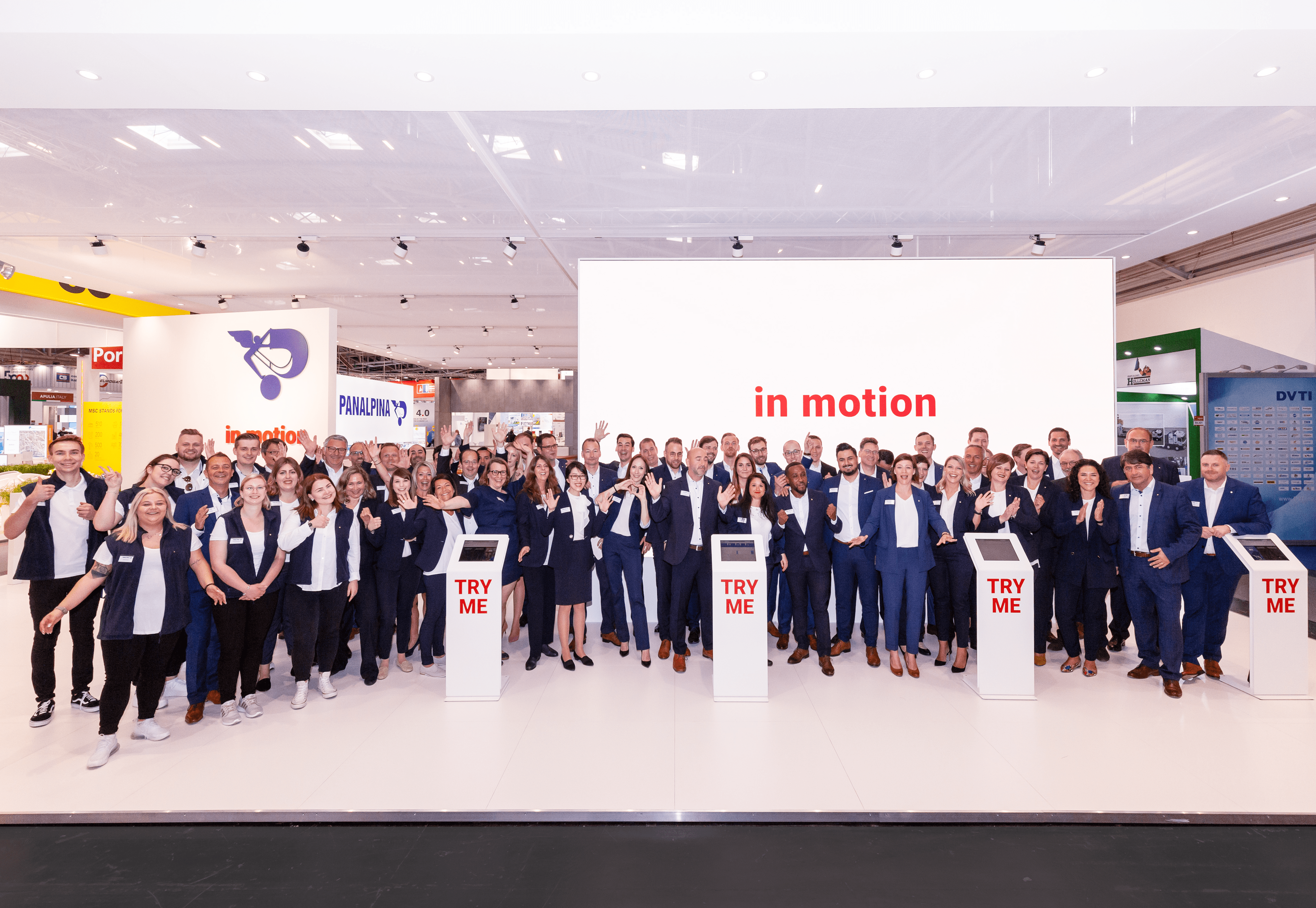
The team and I giving information about the product.
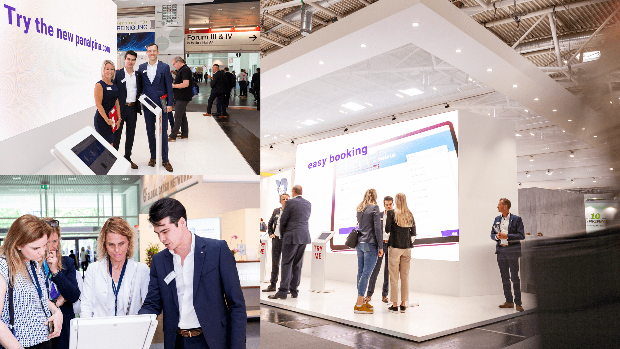
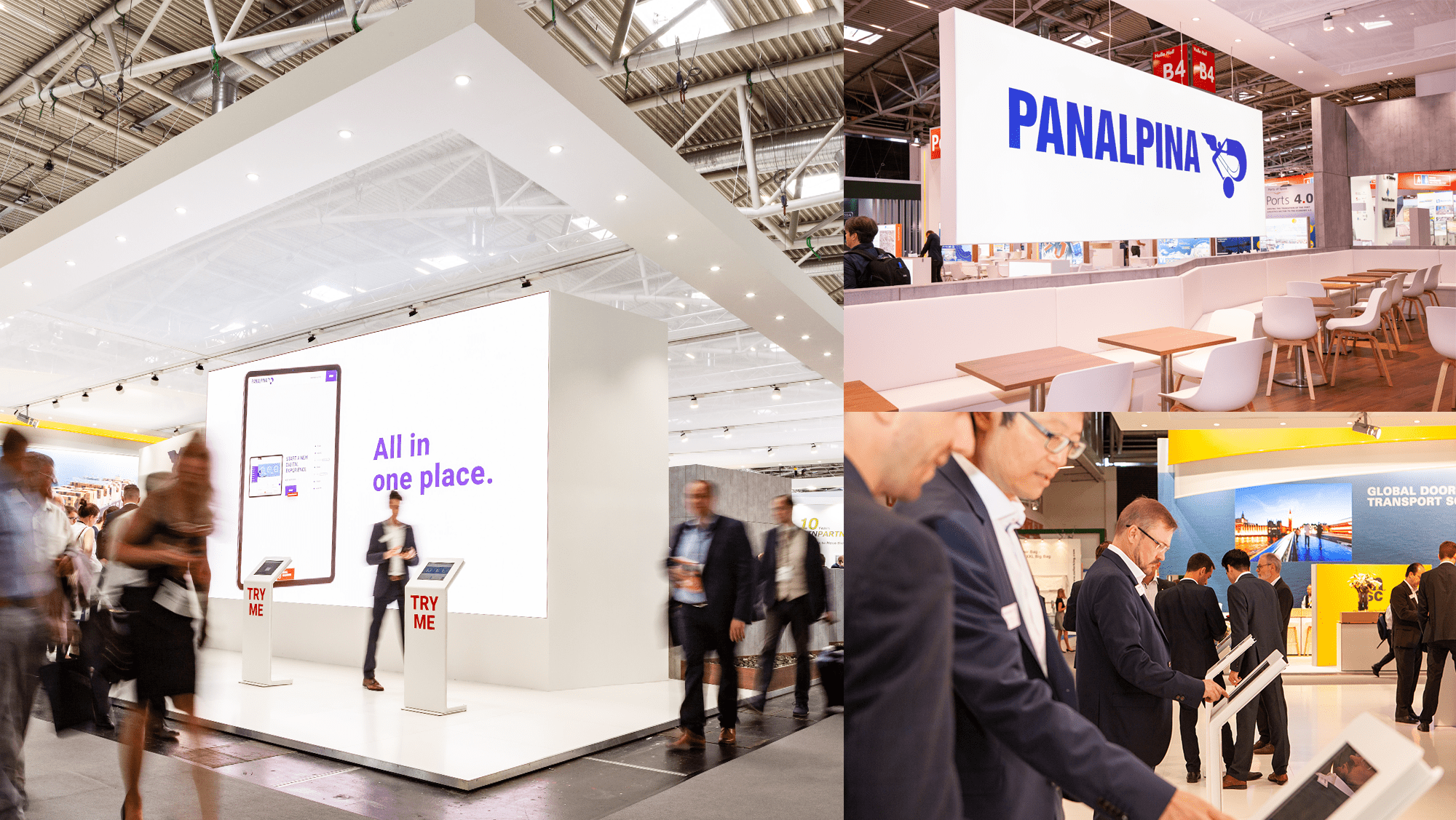
more impressions of the booth.
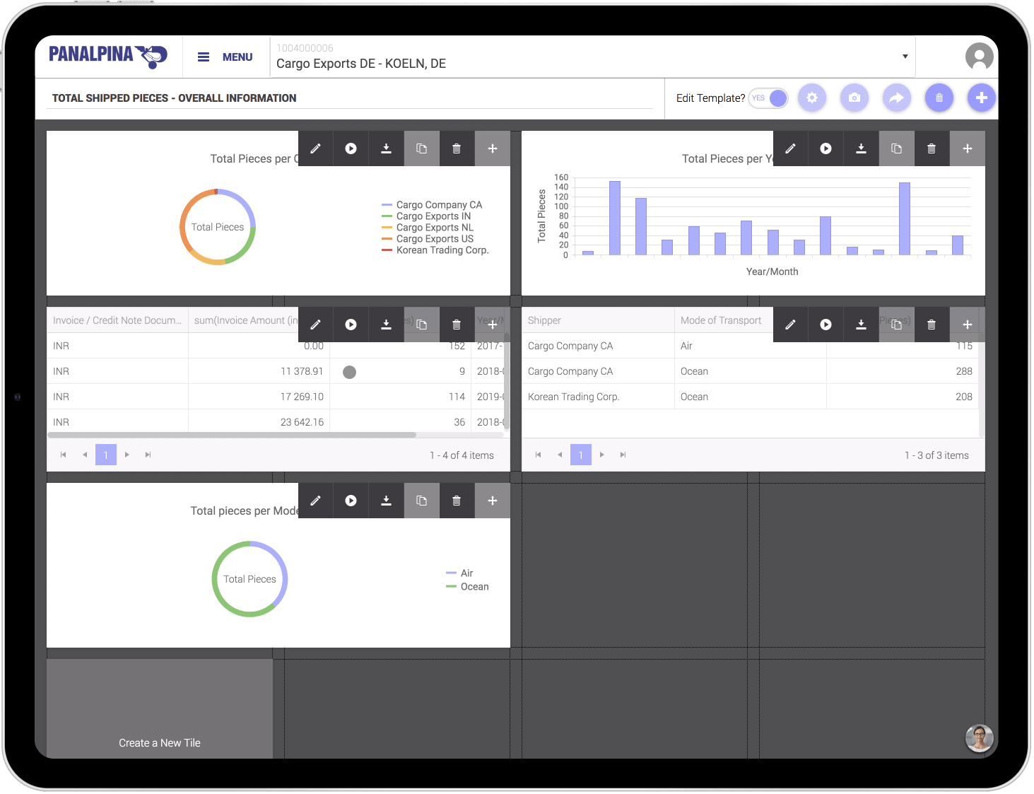
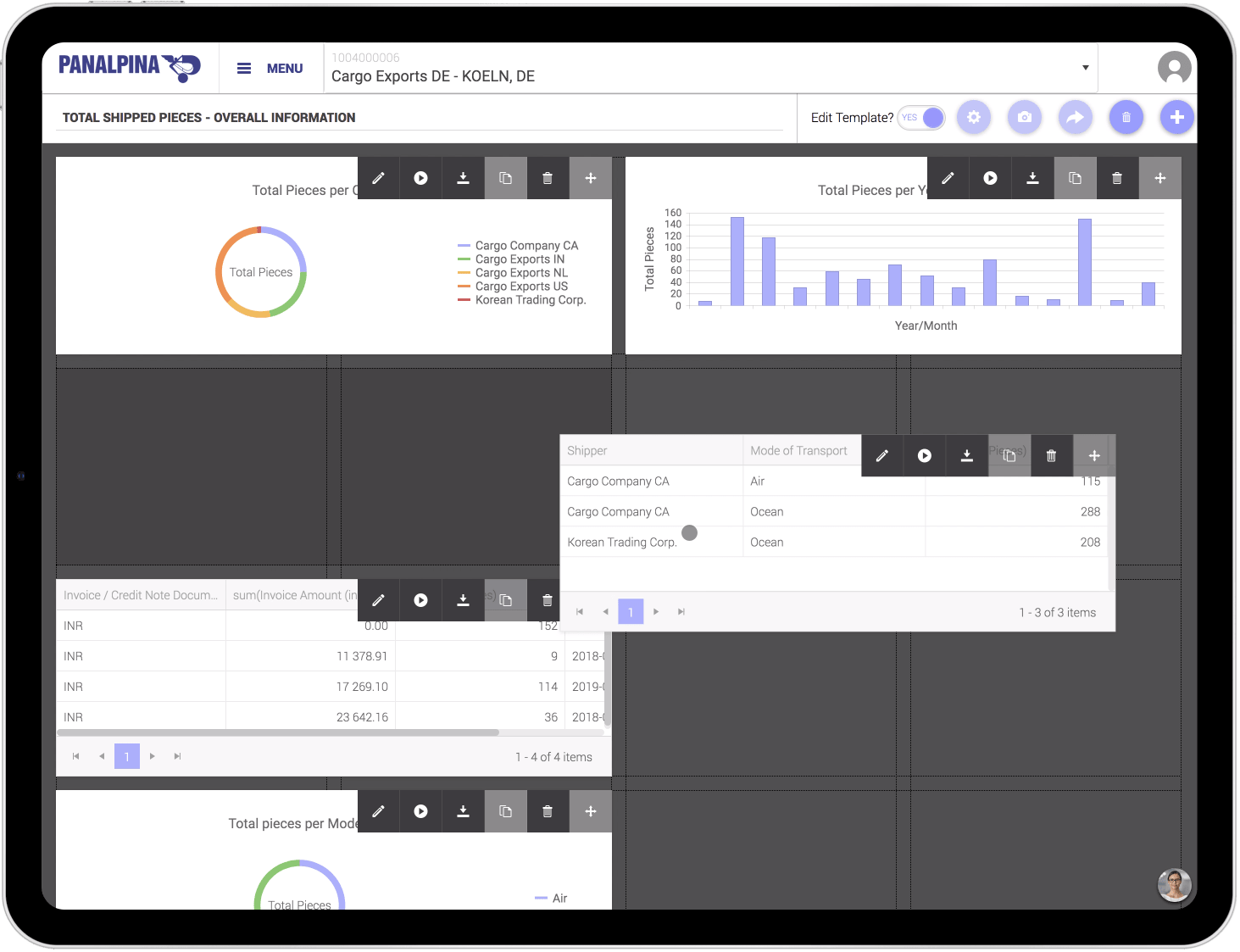
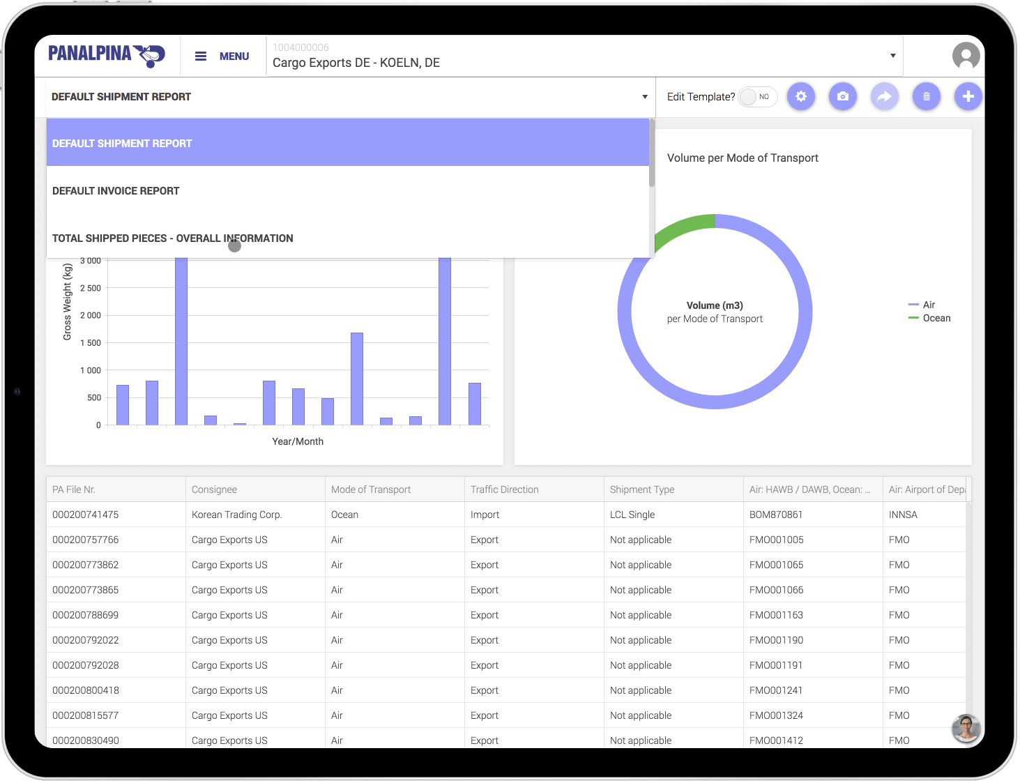
Dashboard on iPad Pro
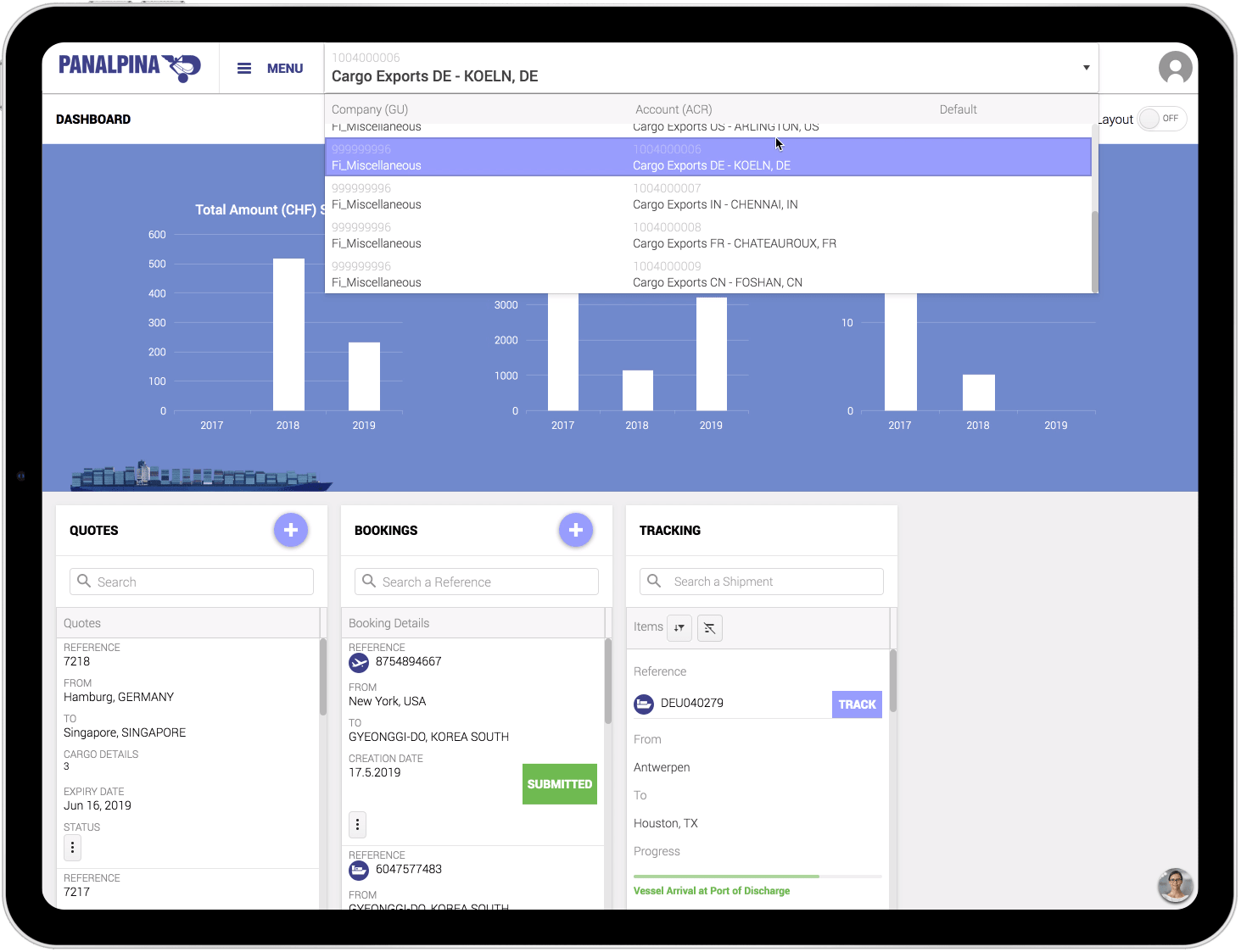
Quote on iPad Pro
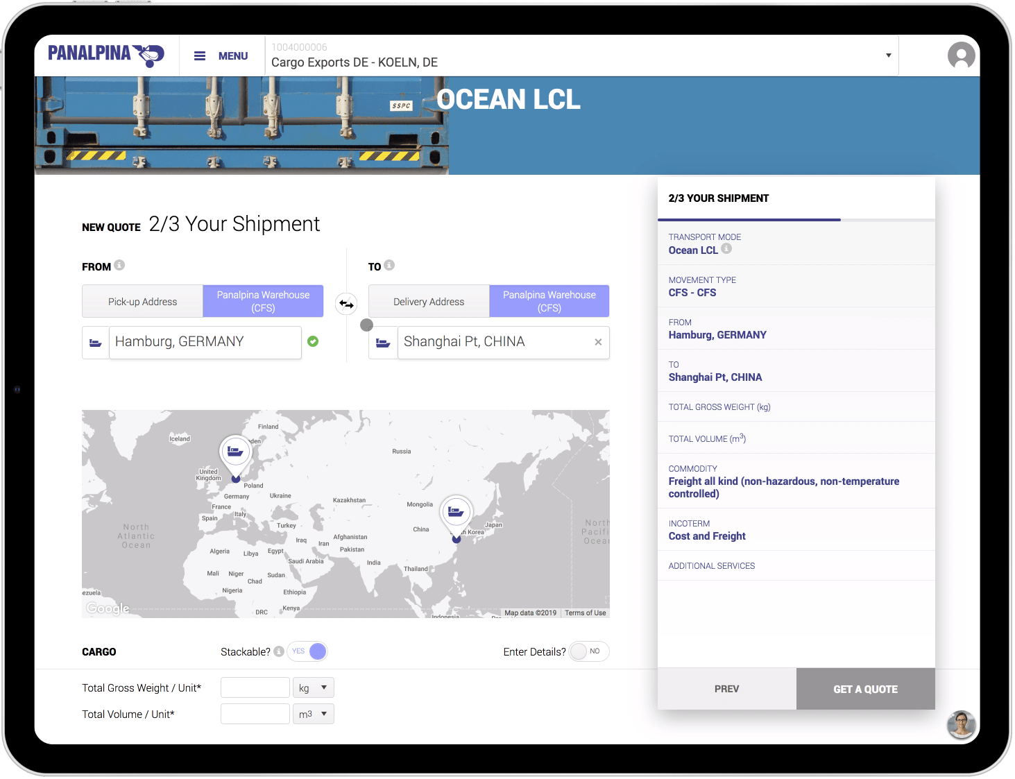
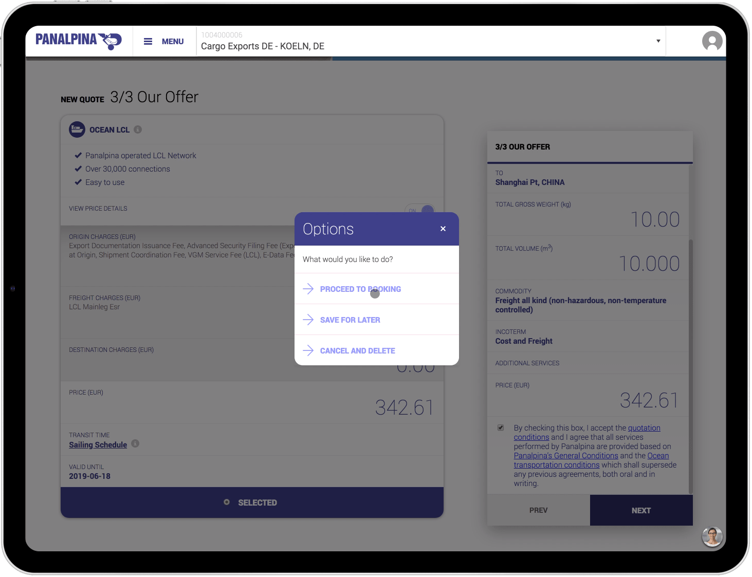
Book on iPad Pro
Track on iPad Pro
Analyze on iPad Pro
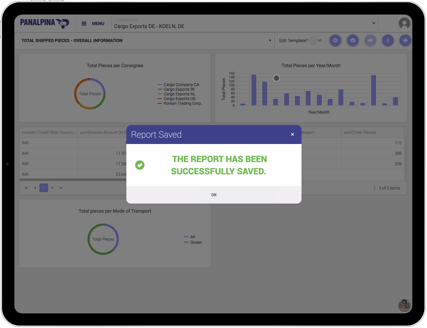
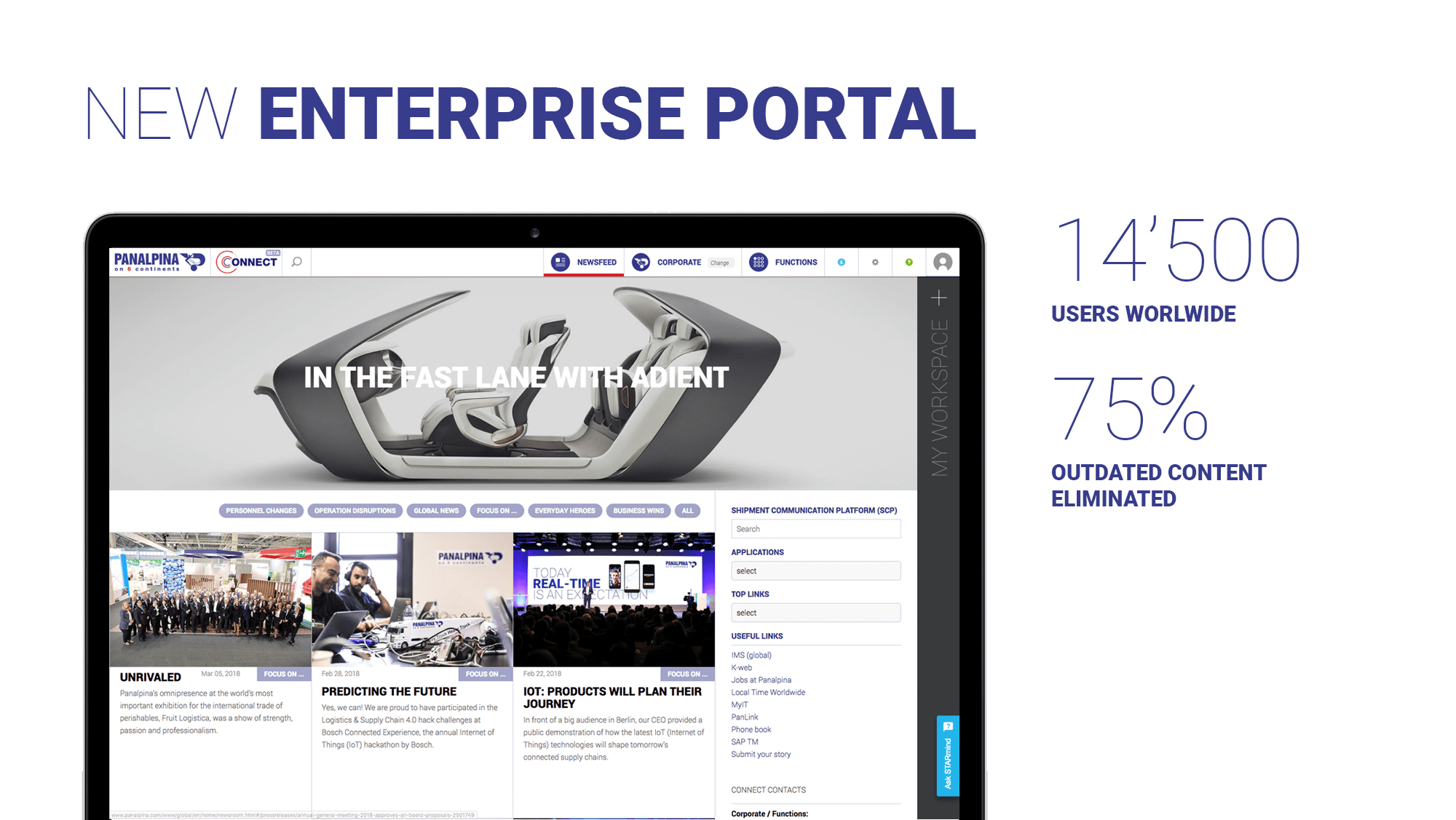
I was asked to redesign the user experience, the user interface, and to implement (HTML/CSS/JS) the new company's intranet, visited by 14'500 users daily in more than 70 countries.
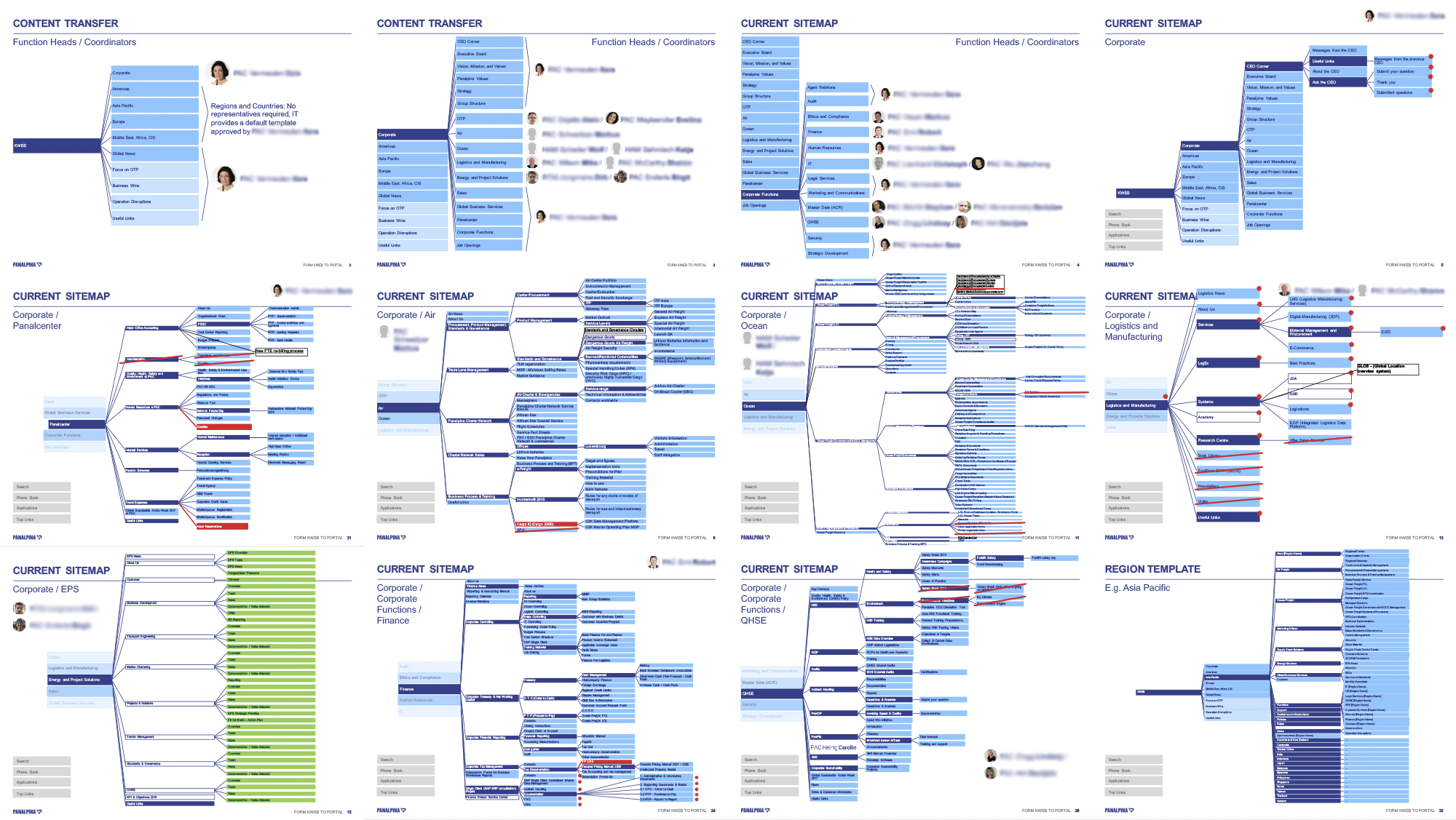
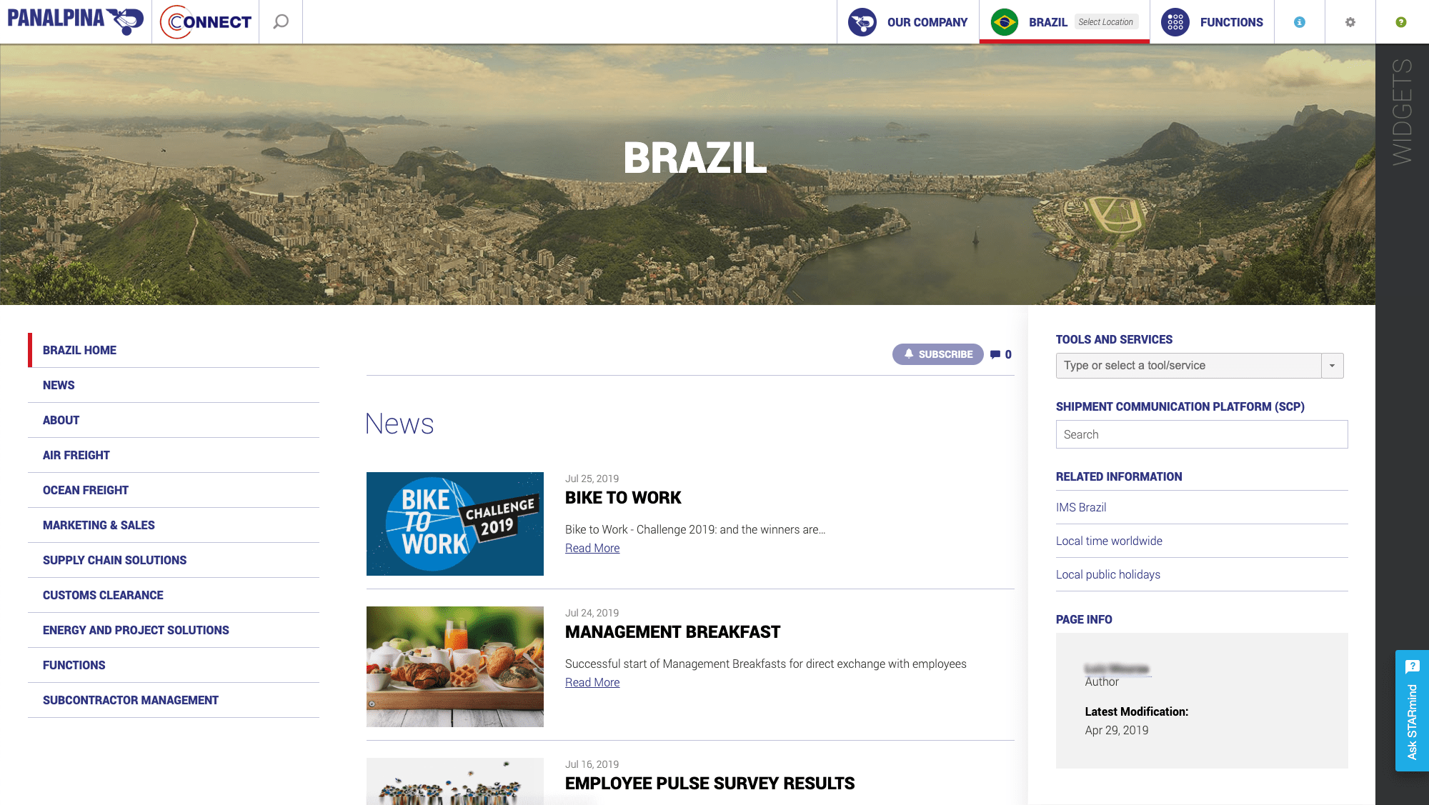
The main challenge was to completely rethink the information architecture in order to find an optimal way for employees to access a large number of pages.
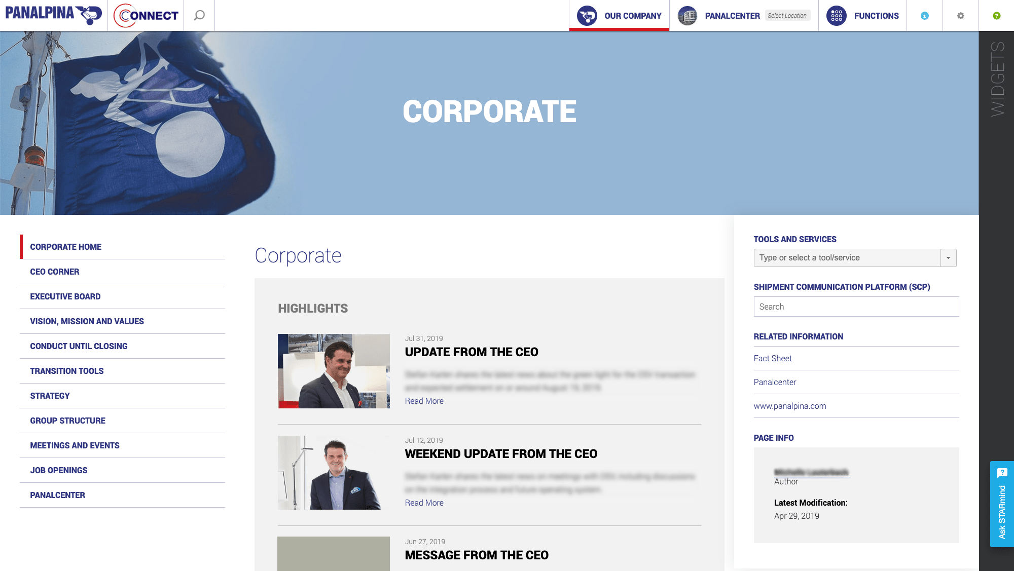
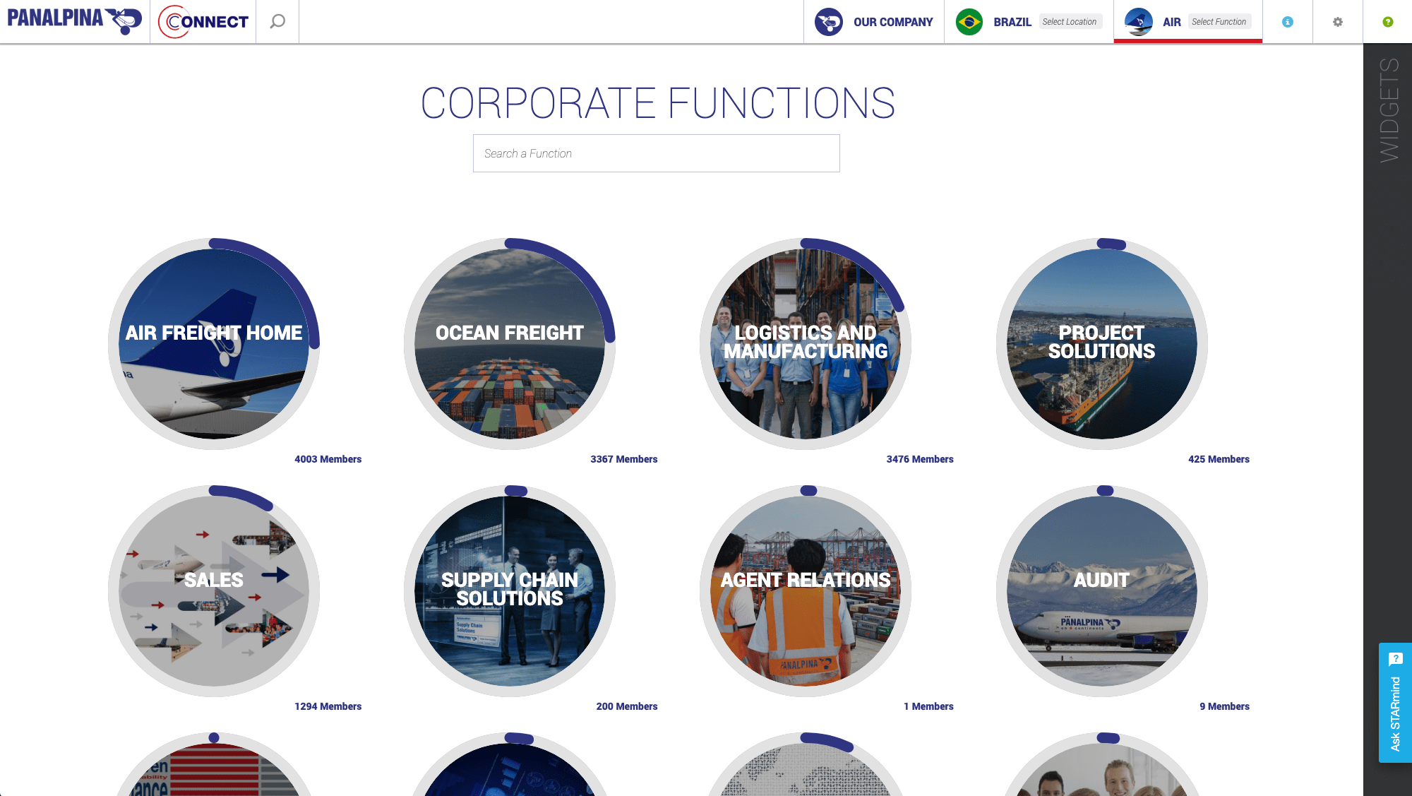
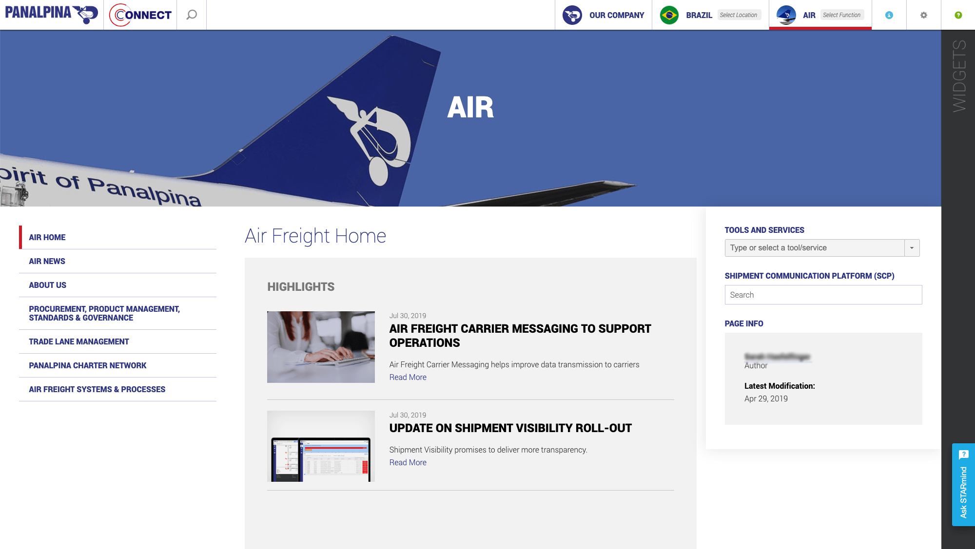
The information is categorized into three points of access: Company information (Corporate), by location (Country), or by department (Function).
The location is the user's location (Country) by default but the user can navigate to another country at any time.
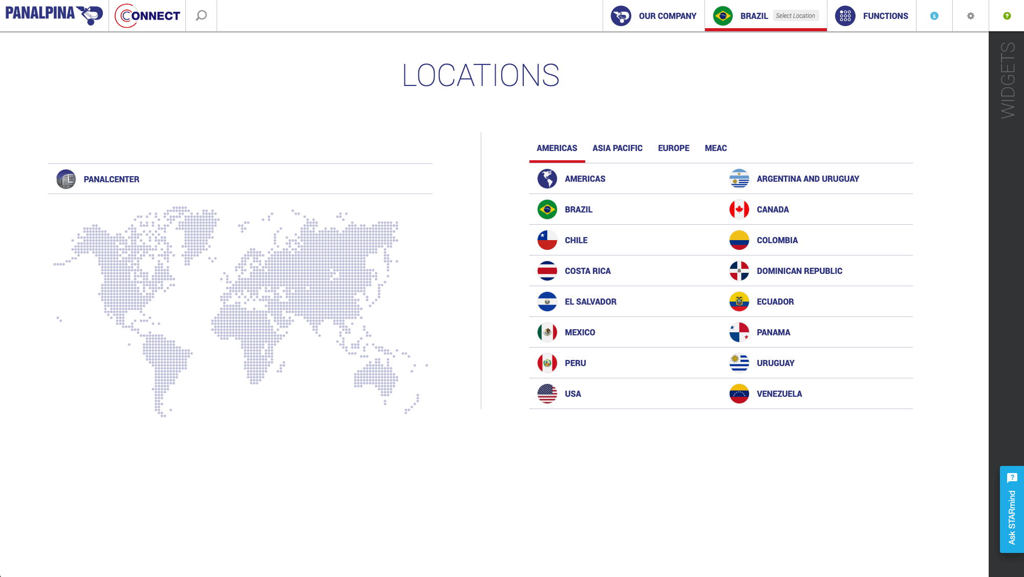
Each country follows the same page structure with the possibility to add pages.
The department is the user's department (Function) by default but the user can navigate to another department at any time.
Each department follows the same page structure with the possibility to add pages.
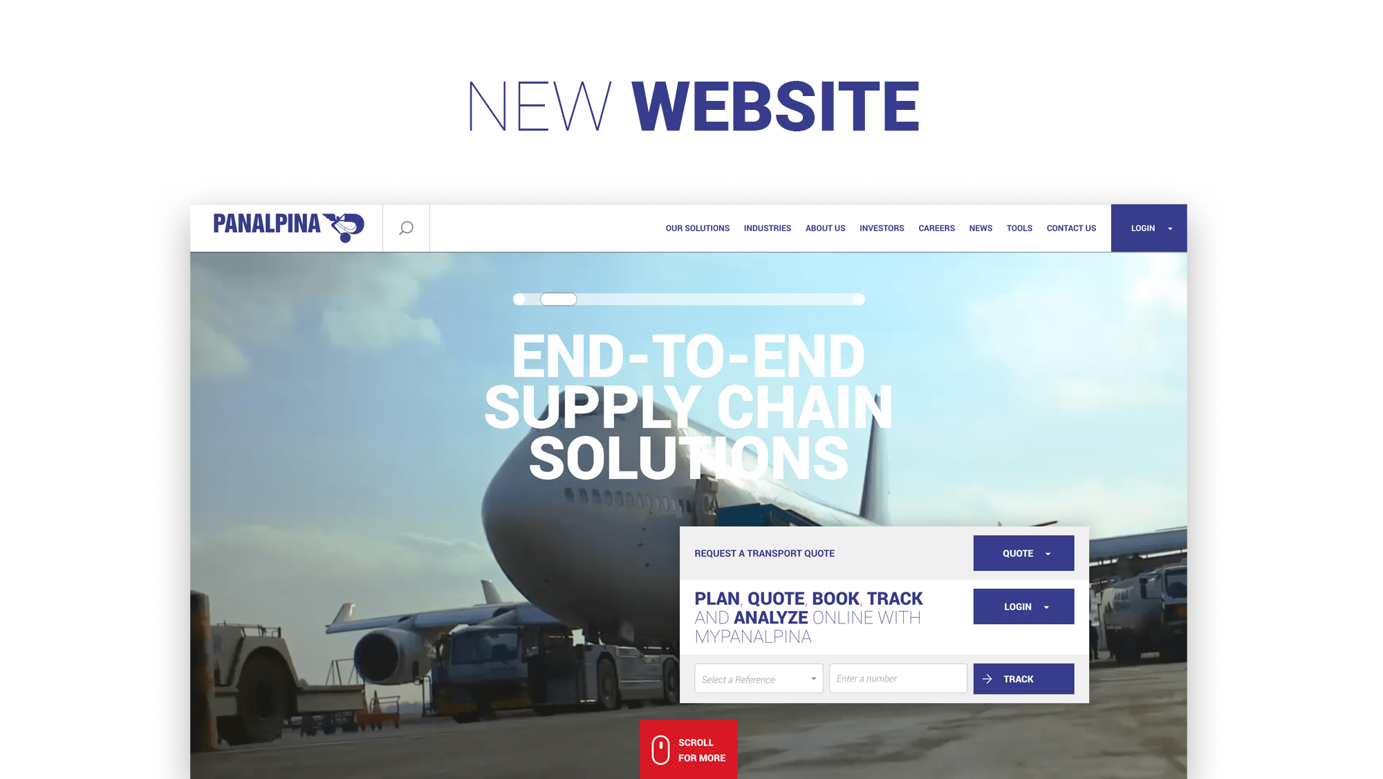
Another core project, was the revamping of the website homepage, featuring faster access to online services such as getting a quote, tracking a shipment, or finding a local office.
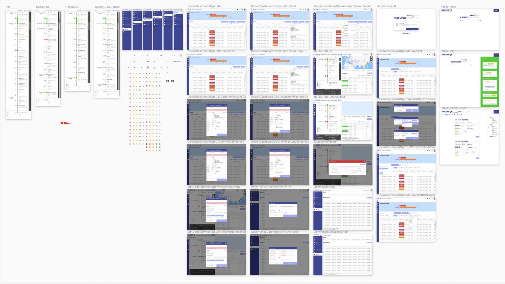
Shipment Visibility is an application being used by Panalpina's operators to manually update a shipment status if necessary (Statuses being automatically updated in the majority of cases).
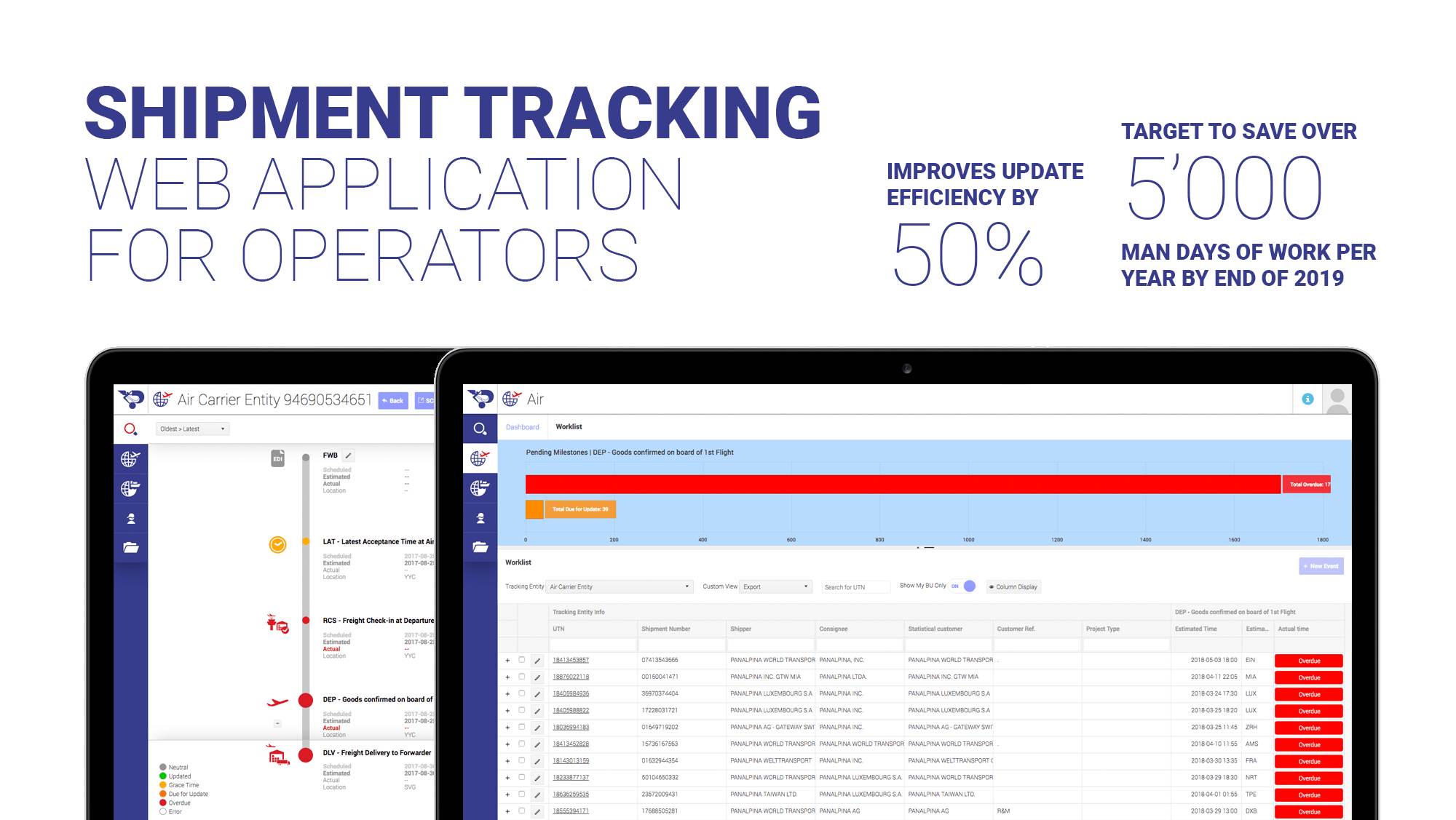
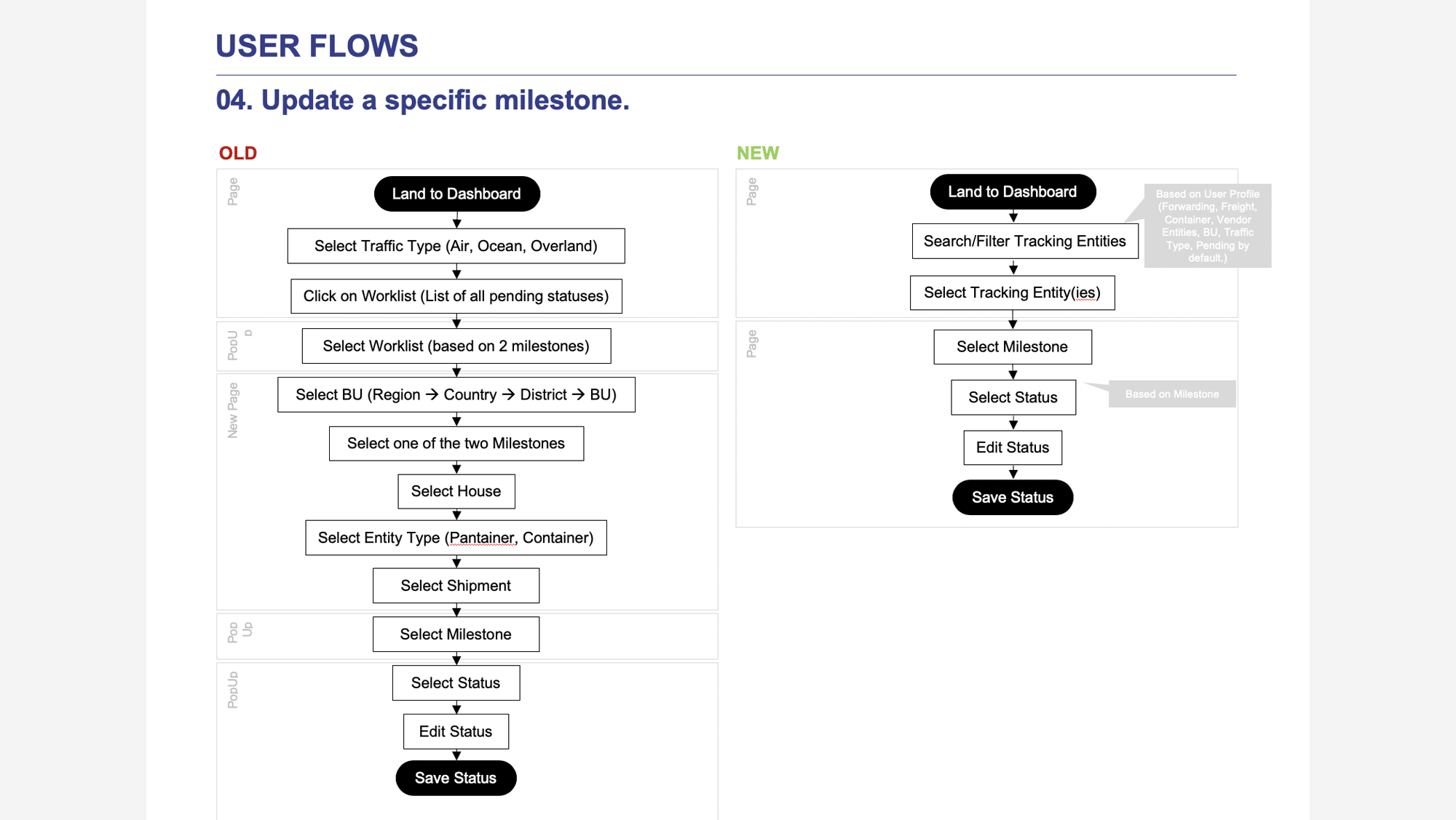
Improving the efficiency by simplifying the user flow and therefore reducing the time for a user to complete an update was key to the product's success.
The user interface is optimized for the operator's station. A reporting feature is also available for team managers.
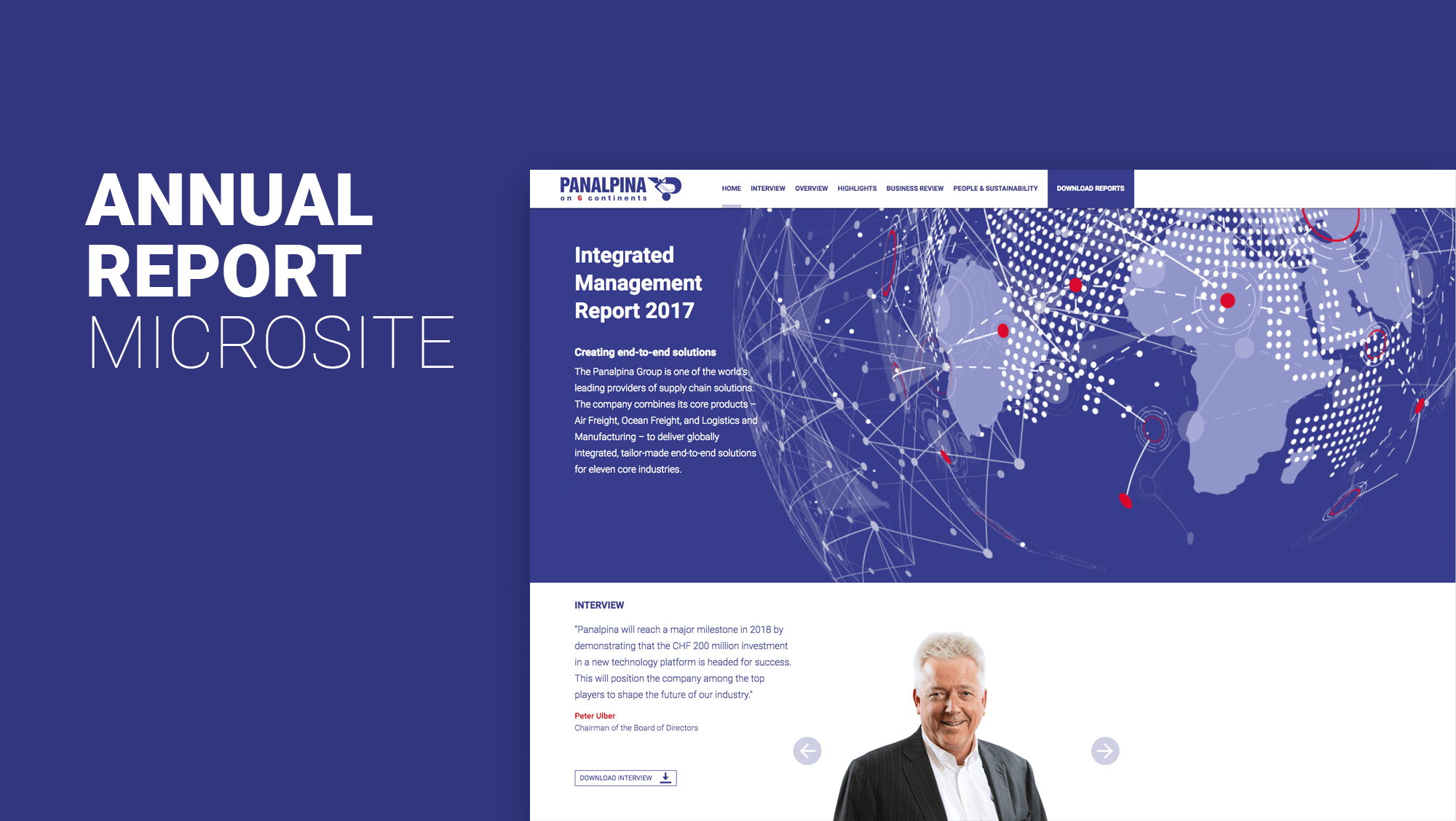
The new digital design guidelines being applied to the annual report microsite...
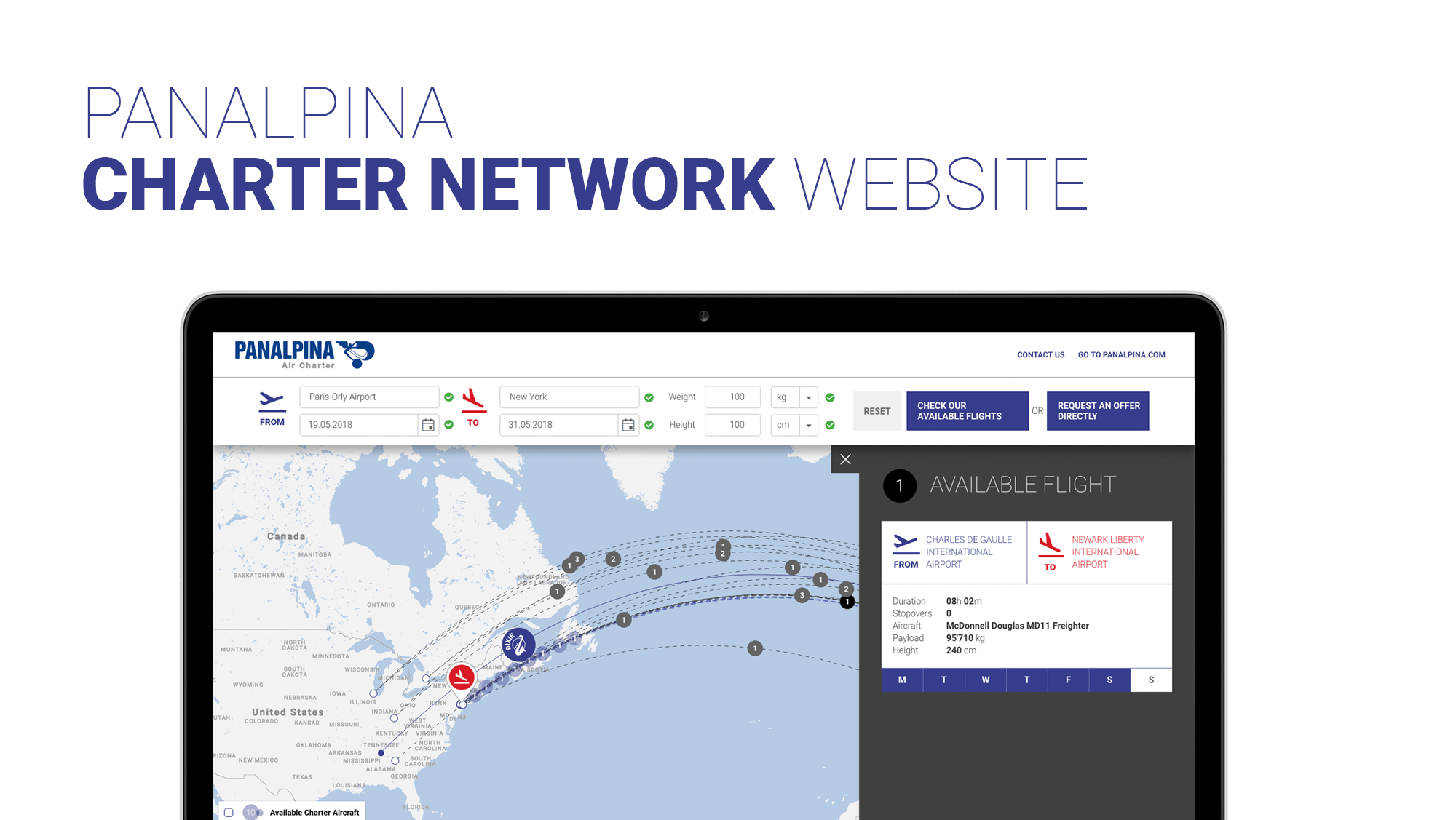
... The Charter Network microsite...
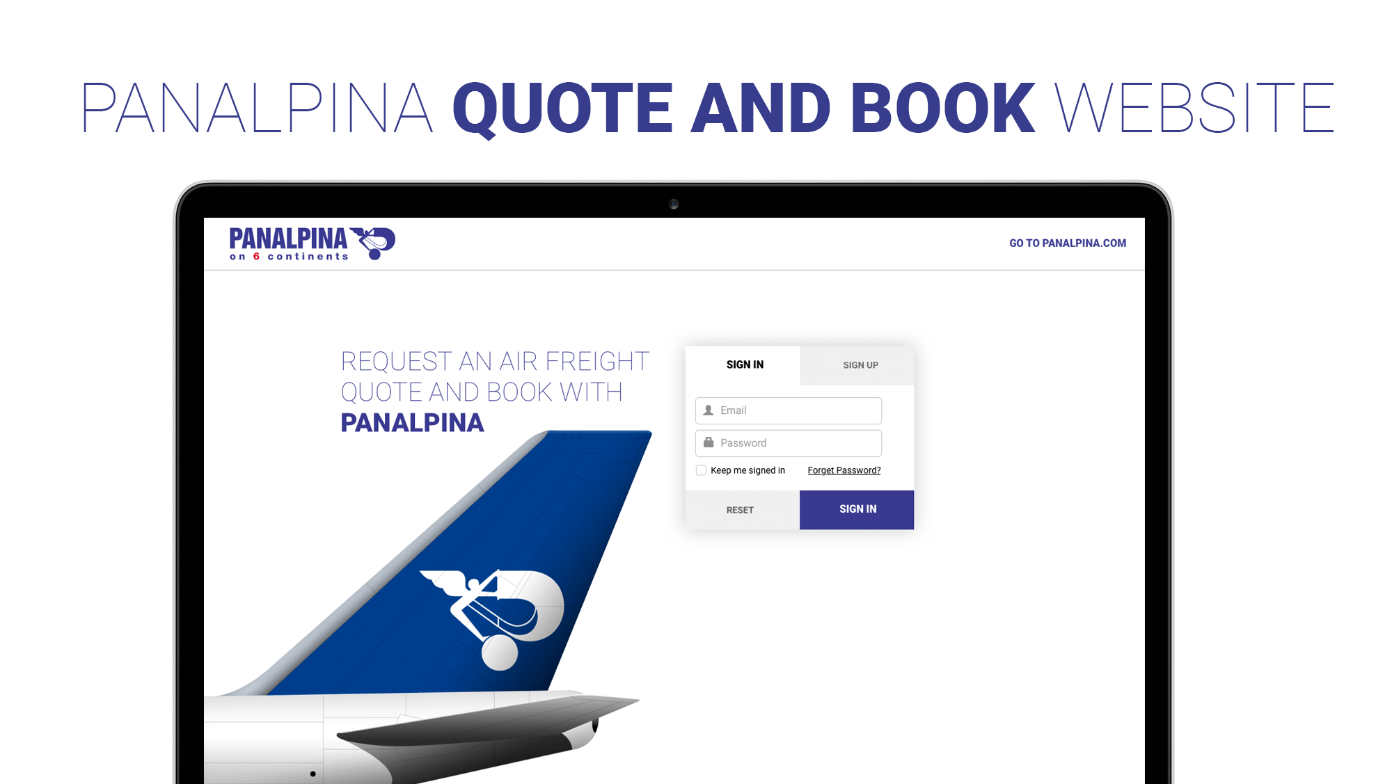
... The Quote and Book microsite...
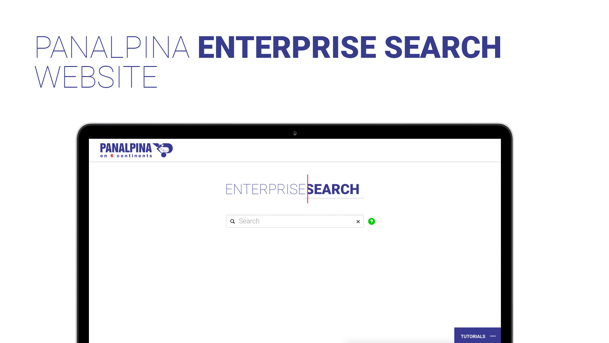
... And the internal enterprise search.
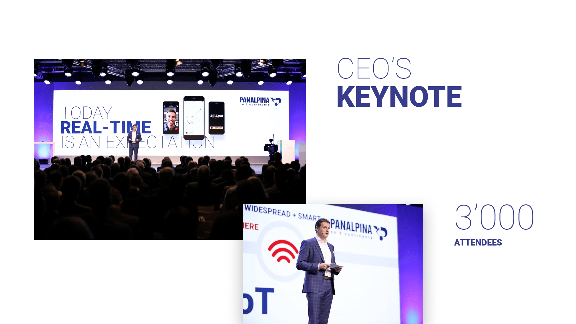
I was also asked to design the CEO's keynote about the future of connected supply chains, at Bosch Connected World in Berlin in 2018...
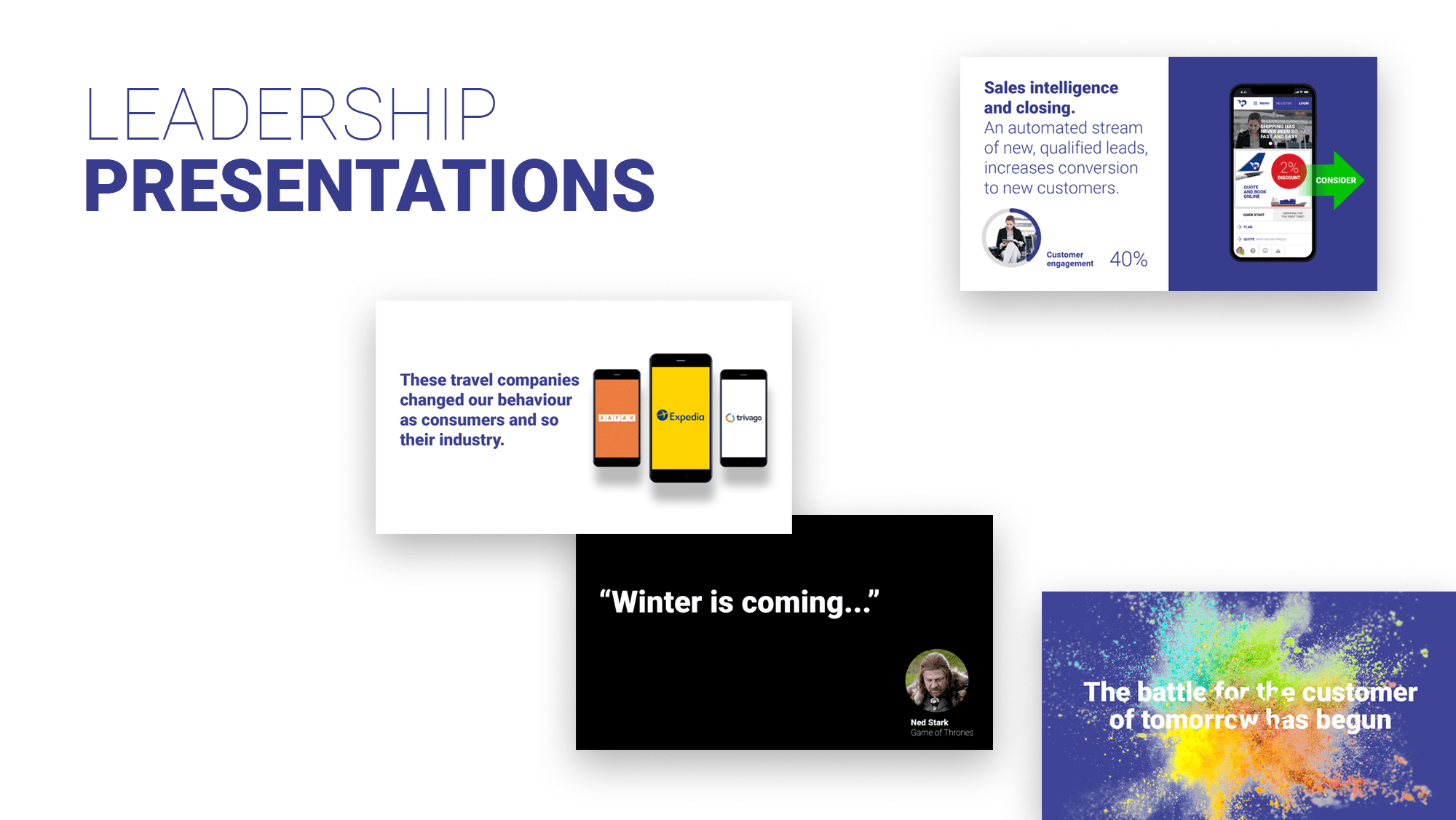
... As well as various other C-Level's presentations...
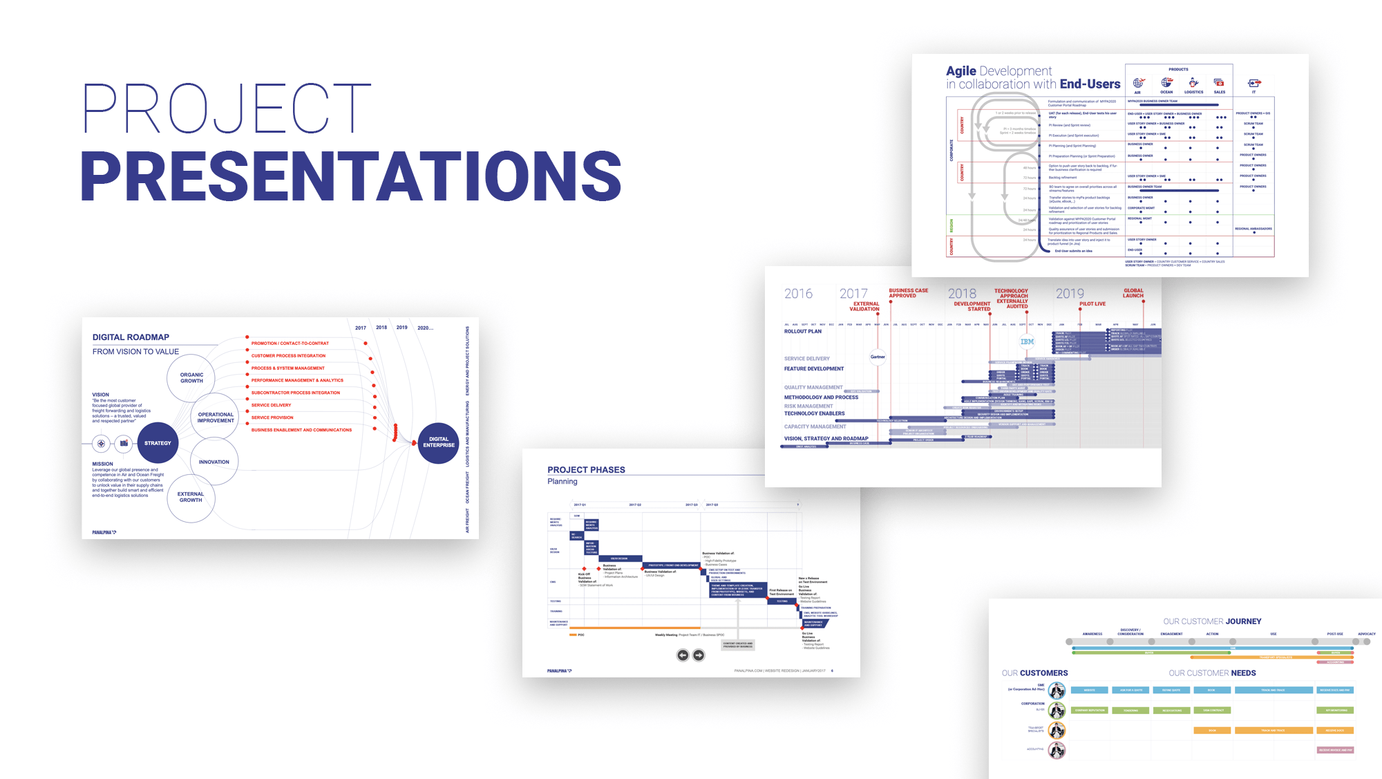
... And project presentations.
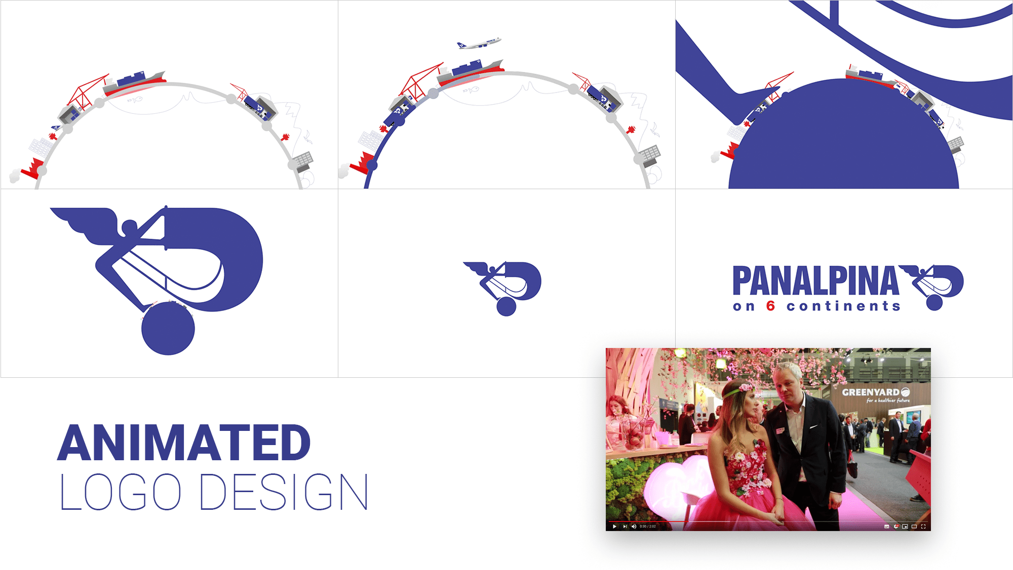
I had the opportunity to create an animated version of the Panalpina logo...
... And the new brand livery applied on various items, from a truck...
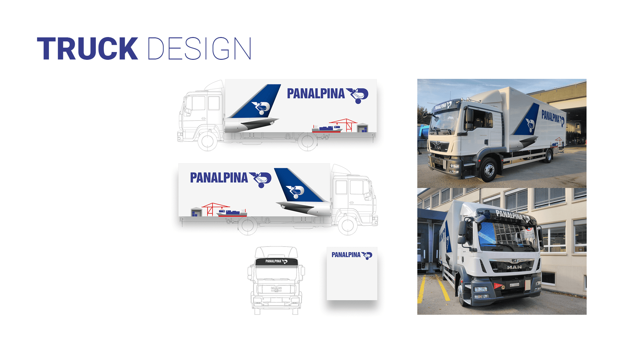
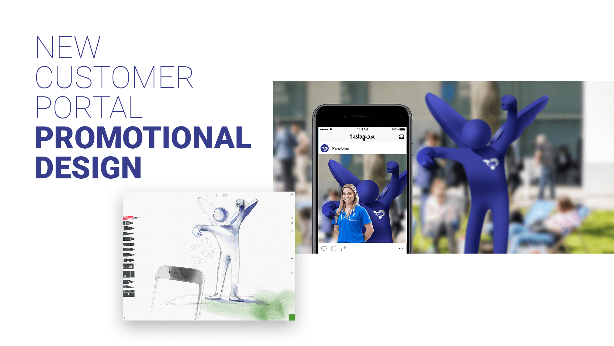
... To a human-sized mascot model.
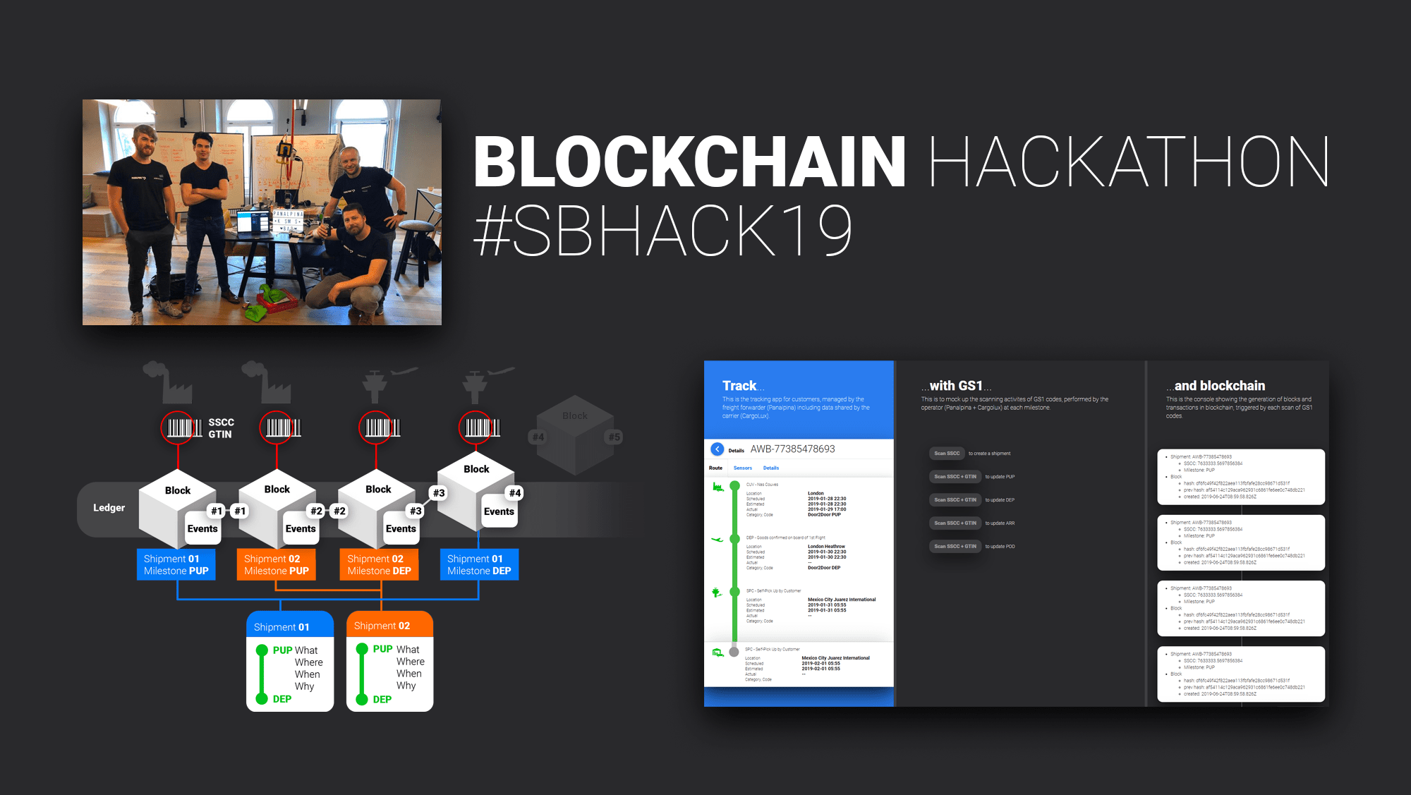
One of my last experience at Panalpina was to participate with my fellow colleagues to the #SBHACK Hackathon in Zurich, Switzerland's biggest blockchain hackathon. We were able to successfully demonstrate a real and practical solution to track and authenticate pharmaceutical products using blockchain.
© Takeo Yoshida. This site and contents are copyright Takeo Yoshida and may not be reproduced anywhere at anytime in anyform.